Blazor UI: Theming
Introduction
ABP Framework provides a complete UI Theming system with the following goals:
- Reusable application modules are developed theme-independent, so they can work with any UI theme.
- UI theme is decided by the final application.
- The theme is distributed via a NuGet package, so it is easily upgradable.
- The final application can customize the selected theme.
In order to accomplish these goals, ABP Framework;
- Determines a set of base libraries used and adapted by all the themes. So, module and application developers can depend on and use these libraries without depending on a particular theme.
- Provides a system that consists of layout parts (like navigation menus and toolbars) that is implemented by all the themes. So, the modules and the application to contribute to the layout to compose a consistent application UI.
Current Themes
Currently, two themes are officially provided:
- The Basic Theme is the minimalist theme with the plain Bootstrap style. It is open source and free.
- The Lepton Theme is a commercial theme developed by the core ABP team and is a part of the ABP Commercial license.
Overall
The Base Libraries
All the themes must depend on the Volo.Abp.AspNetCore.Components.WebAssembly.Theming NuGet package, so they are indirectly depending on the following libraries:
- Twitter Bootstrap as the fundamental HTML/CSS framework.
- Blazorise as a component library that supports the Bootstrap and adds extra components like Data Grid and Tree.
- FontAwesome as the fundamental CSS font library.
- Flag Icon as a library to show flags of countries.
These libraries are selected as the base libraries and available to the applications and modules.
Bootstrap's JavaScript part is not used since the Blazorise library already provides the necessary functionalities to the Bootstrap components in a native way.
The Layout
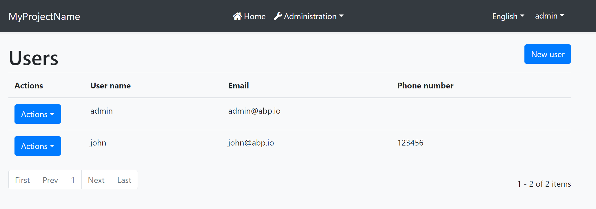
All themes must define a layout for the application. The following image shows the user management page in the Basic Theme application layout:
And the same page is shown below with the Lepton Theme application layout:
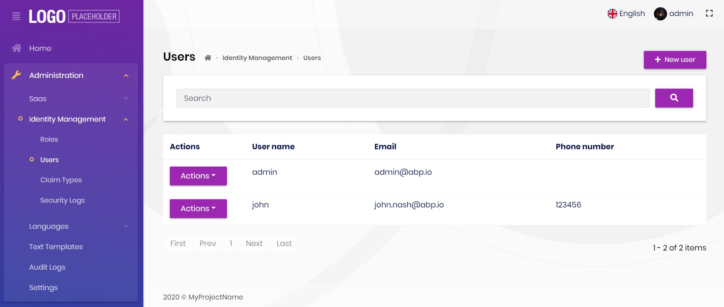
As you can see, the page is the same, but the look is completely different in the themes above.
The application layout typically includes the following parts;
- A main menu
- Main Toolbar with the following components;
- User menu
- Language switch dropdown
- Page alerts
- The page content (aka
@Body)
Implementing a Theme
A theme is simply a Razor Class Library.
The Easy Way
The easiest way to create a new theme is to copy the Basic Theme Source Code and customize it. Once you get a copy of the theme in your solution, remove the Volo.Abp.AspNetCore.Mvc.UI.Theme.Basic NuGet package and reference to the local project.
Global Styles / Scripts
A theme generally needs to add a global style to the page. ABP provides a system to manage the Global Styles and Scripts. A theme can implement the IBundleContributor to add global style or script files to the page.
Example: Adding a style to the page
using Volo.Abp.Bundling;

namespace MyTheme
{
    public class MyThemeBundleContributor : IBundleContributor
    {
        public void AddScripts(BundleContext context)
        {

        }

        public void AddStyles(BundleContext context)
        {
            context.Add("_content/MyTheme/styles.css");
        }
    }
}
styles.css file should be added into the wwwroot folder of the theme project for this example. When you use the abp bundle command, this class is automatically discovered and executed to add the style to the page.
See the Global Styles and Scripts document for more.
Layout Parts
A typical Layout consists of several parts. The theme should include the necessary parts in each layout.
Example: The Basic Theme has the following parts for the Application Layout
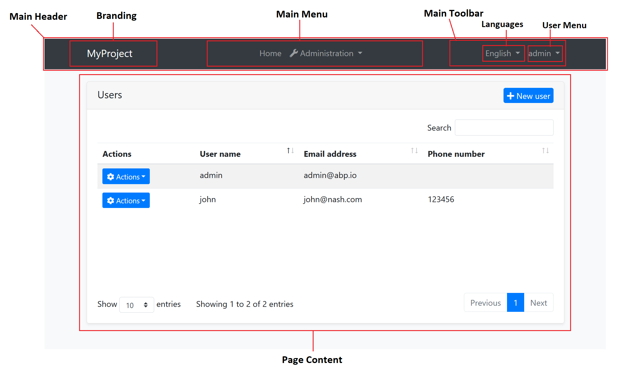
The application code and the modules can only show contents in the Page Content part. If they need to change the other parts (to add a menu item, to add a toolbar item, to change the application name in the branding area...) they should use the ABP Framework APIs.
The following sections explain the fundamental parts pre-defined by the ABP Framework and can be implemented by the themes.
It is a good practice to split the layout into components/partials, so the final application can override them partially for customization purpose.
Branding
IBrandingProvider service should be used to get the name and the logo URL of the application to render in the Branding part.
The Application Startup Template has an implementation of this interface to set the values by the application developer.
Main Menu
IMenuManager service is used to get the main menu items and render on the layout.
Example: Get the Main Menu to render in a razor component
// Code behind file of a razor component
public partial class NavMenu
{
    private readonly IMenuManager _menuManager;

    public NavMenu(IMenuManager menuManager)
    {
        _menuManager = menuManager;
    }

    protected override async Task OnInitializedAsync()
    {
        var menu = await _menuManager.GetAsync(StandardMenus.Main);
        //...
    }
}
See the Navigation / Menus document to learn more about the navigation system.
Main Toolbar
IToolbarManager service is used to get the Main Toolbar items and render on the layout. Each item of this toolbar is a Razor Component, so it may include any type of UI elements. Inject the IToolbarManager and use the GetAsync to get the toolbar items:
var toolbar = await _toolbarManager.GetAsync(StandardToolbars.Main);
See the Toolbars document to learn more on the toolbar system.
The theme has a responsibility to add two pre-defined items to the main toolbar: Language Selection and User Menu. To do that, create a class implementing the IToolbarContributor interface and add it to the AbpToolbarOptions as shown below:
Configure<AbpToolbarOptions>(options =>
{
    options.Contributors.Add(new BasicThemeMainTopToolbarContributor());
});
Language Selection
Language Selection toolbar item is generally a dropdown that is used to switch between languages. ILanguageProvider is used to get the list of available languages and CultureInfo.CurrentUICulture is used to learn the current language.
Local Storage is used to get and set the current language with the Abp.SelectedLanguage key.
Example: Get the currently selected language
var selectedLanguageName = await JsRuntime.InvokeAsync<string>(
    "localStorage.getItem",
    "Abp.SelectedLanguage"
    );
Example: Set the selected language
await JsRuntime.InvokeVoidAsync(
    "localStorage.setItem",
    "Abp.SelectedLanguage",
    "en-US"
    );
The theme should reload the page after changing the language:
await JsRuntime.InvokeVoidAsync("location.reload");
User Menu
User menu includes links related to the user account. IMenuManager is used just like the Main Menu, but this time with StandardMenus.User parameter like shown below:
var menu = await _menuManager.GetAsync(StandardMenus.User);
ICurrentUser and ICurrentTenant services can be used to obtain the current user and tenant names.
Page Alerts
IAlertManager service is used to get the current page alerts to render on the layout. See the Page Alerts document to learn more.
 08-09 May


