Blazor UI: Notification Service
IUiNotificationService is used to show toast style notifications on the user interface.
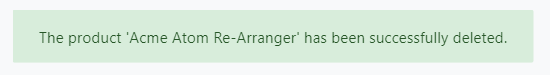
Quick Example
Simply inject IUiNotificationService to your page or component and call the Success method to show a success message.
namespace MyProject.Blazor.Pages
{
    public partial class Index
    {
        private readonly IUiNotificationService _uiNotificationService;

        public Index(IUiNotificationService uiNotificationService)
        {
            _uiNotificationService = uiNotificationService;
        }

        public async Task DeleteAsync()
        {
            await _uiNotificationService.Success(
                "The product 'Acme Atom Re-Arranger' has been successfully deleted."
            );
        }
    }
}
If you inherit your page or component from the AbpComponentBase class, you can use the the Notify property to access the IUiNotificationService as a pre-injected property.
namespace MyProject.Blazor.Pages
{
    public partial class Index : AbpComponentBase
    {
        public async Task DeleteAsync()
        {
            await Notify.Success(
                "The product 'Acme Atom Re-Arranger' has been successfully deleted."
            );
        }
    }
}
You typically use
@inherits AbpComponentBasein the.razorfile to inherit from theAbpComponentBase, instead of inheriting in the code behind file.
Notification Types
There are four types of pre-defined notifications;
Info(...)Success(...)Warn(...)Error(...)
All of the methods above gets the following parameters;
message: The message (string) to be shown.title: An optional (string) title.options: An optional (Action) to configure notification options.
Configuration
Per Notification
It is easy to change default notification options if you like to customize it per notification. Provide an action to the options parameter as shown below:
await UiNotificationService.Success(
    "The product 'Acme Atom Re-Arranger' has been successfully deleted.",
    options: (options) =>
    {
        options.OkButtonText =
            LocalizableString.Create<MyProjectNameResource>("CustomOK");
    });
Available Options
Here, the list of all available options;
OkButtonText: Custom text for the OK button.OkButtonIcon: Custom icon for the OK button
Global Configuration
You can also configure global notification options to control the it in a single point. Configure the UiNotificationOptions options class in the ConfigureServices of your module:
Configure<UiNotificationOptions>(options =>
{
    options.OkButtonText = LocalizableString.Create<MyProjectNameResource>("CustomOK");
});
The same options are available here.
Per notification configuration overrides the default values.
 08-09 May


