ASP.NET Core MVC / Razor Pages: UI Theming
Introduction
ABP Framework provides a complete UI Theming system with the following goals:
- Reusable application modules are developed theme-independent, so they can work with any UI theme.
- UI theme is decided by the final application.
- The theme is distributed via NuGet/NPM packages, so it is easily upgradable.
- The final application can customize the selected theme.
In order to accomplish these goals, ABP Framework;
- Determines a set of base libraries used and adapted by all the themes. So, module and application developers can depend on and use these libraries without depending on a particular theme.
- Provides a system that consists of navigation menus, toolbars, layout hooks... that is implemented by all the themes. So, the modules and the application to contribute to the layout to compose a consistent application UI.
Current Themes
Currently, two themes are officially provided:
- The Basic Theme is the minimalist theme with the plain Bootstrap style. It is open source and free.
- The Lepton Theme is a commercial theme developed by the core ABP team and is a part of the ABP Commercial license.
There are also some community-driven themes for the ABP Framework (you can search on the web).
Overall
The Base Libraries
All the themes must depend on the @abp/aspnetcore.mvc.ui.theme.shared NPM package, so they are indirectly depending on the following libraries:
- Twitter Bootstrap as the fundamental HTML/CSS framework.
- JQuery for DOM manipulation.
- DataTables.Net for data grids.
- JQuery Validation for client side & unobtrusive validation
- FontAwesome as the fundamental CSS font library.
- SweetAlert to show fancy alert message and confirmation dialogs.
- Toastr to show toast notifications.
- Lodash as a utility library.
- Luxon for date/time operations.
- JQuery Form for AJAX forms.
- bootstrap-datepicker to show date pickers.
- Select2 for better select/combo boxes.
- Timeago to show automatically updating fuzzy timestamps.
- malihu-custom-scrollbar-plugin for custom scrollbars.
These libraries are selected as the base libraries and available to the applications and modules.
Abstractions / Wrappers
There are some abstractions in the ABP Framework to make your code independent from some of these libraries too. Examples;
- Tag Helpers makes it easy to generate the Bootstrap UIs.
- JavaScript Message and Notification APIs provides abstractions to use the Sweetalert and Toastr.
- Forms & Validation system automatically handles the validation, so you mostly don't directly type any validation code.
The Standard Layouts
The main responsibility of a theme is to provide the layouts. There are three pre-defined layouts must be implemented by all the themes:
- Application: The default layout which is used by the main application pages.
- Account: Mostly used by the account module for login, register, forgot password... pages.
- Empty: The Minimal layout that has no layout components at all.
Layout names are constants defined in the Volo.Abp.AspNetCore.Mvc.UI.Theming.StandardLayouts class.
The Application Layout
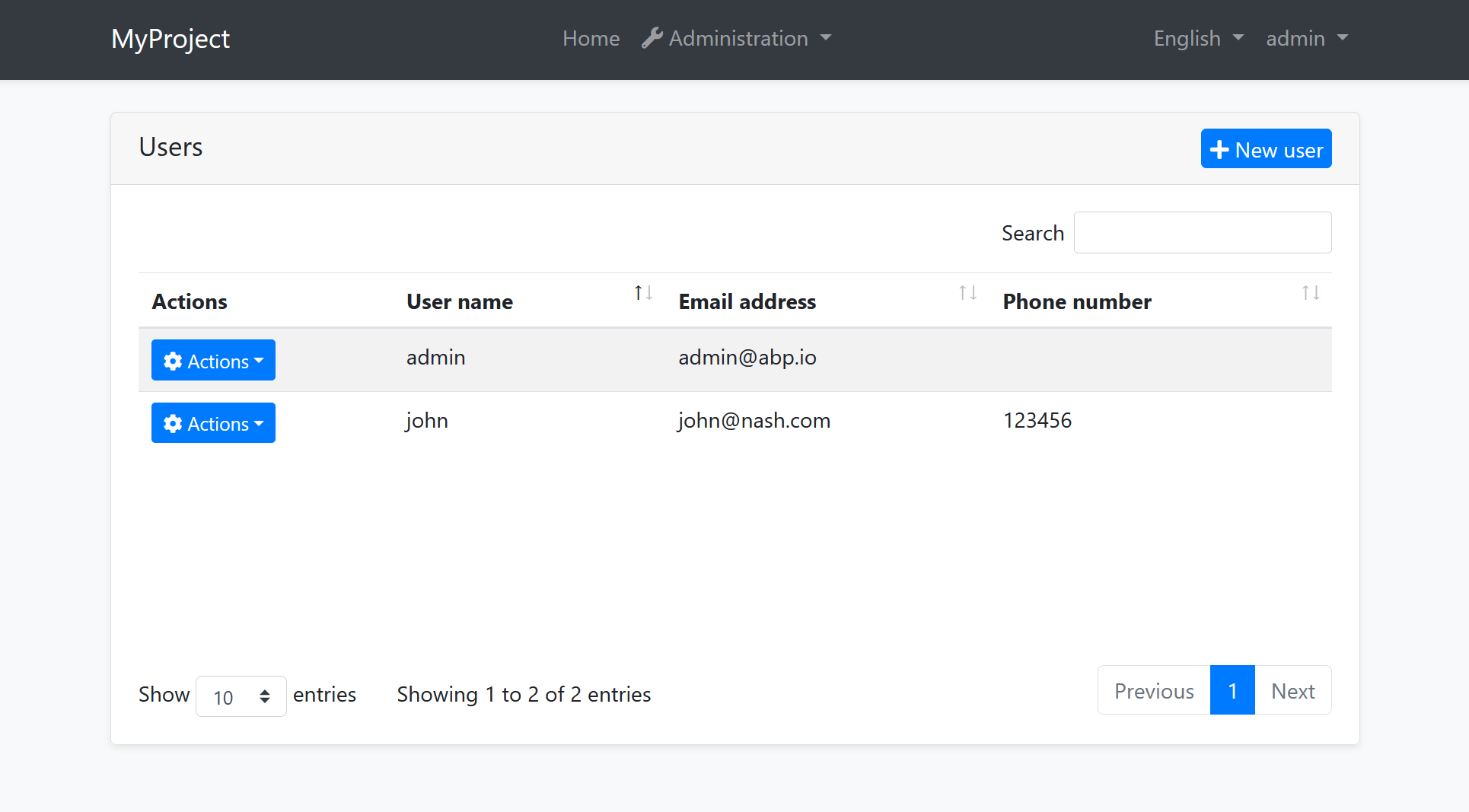
This is the default layout which is used by the main application pages. The following image shows the user management page in the Basic Theme application layout:
And the same page is shown below with the Lepton Theme application layout:

As you can see, the page is the same, but the look is completely different in the themes above.
The application layout typically includes the following parts;
- A main menu
- Main Toolbar with the following components;
- User menu
- Language switch dropdown
- Page alerts
- The page content (aka
RenderBody()) - Layout hooks
Some themes may provide more parts like breadcrumbs, page header & toolbar... etc. See the Layout Parts section.
The Account Layout
The Account layout is typically used by the account module for login, register, forgot password... pages.
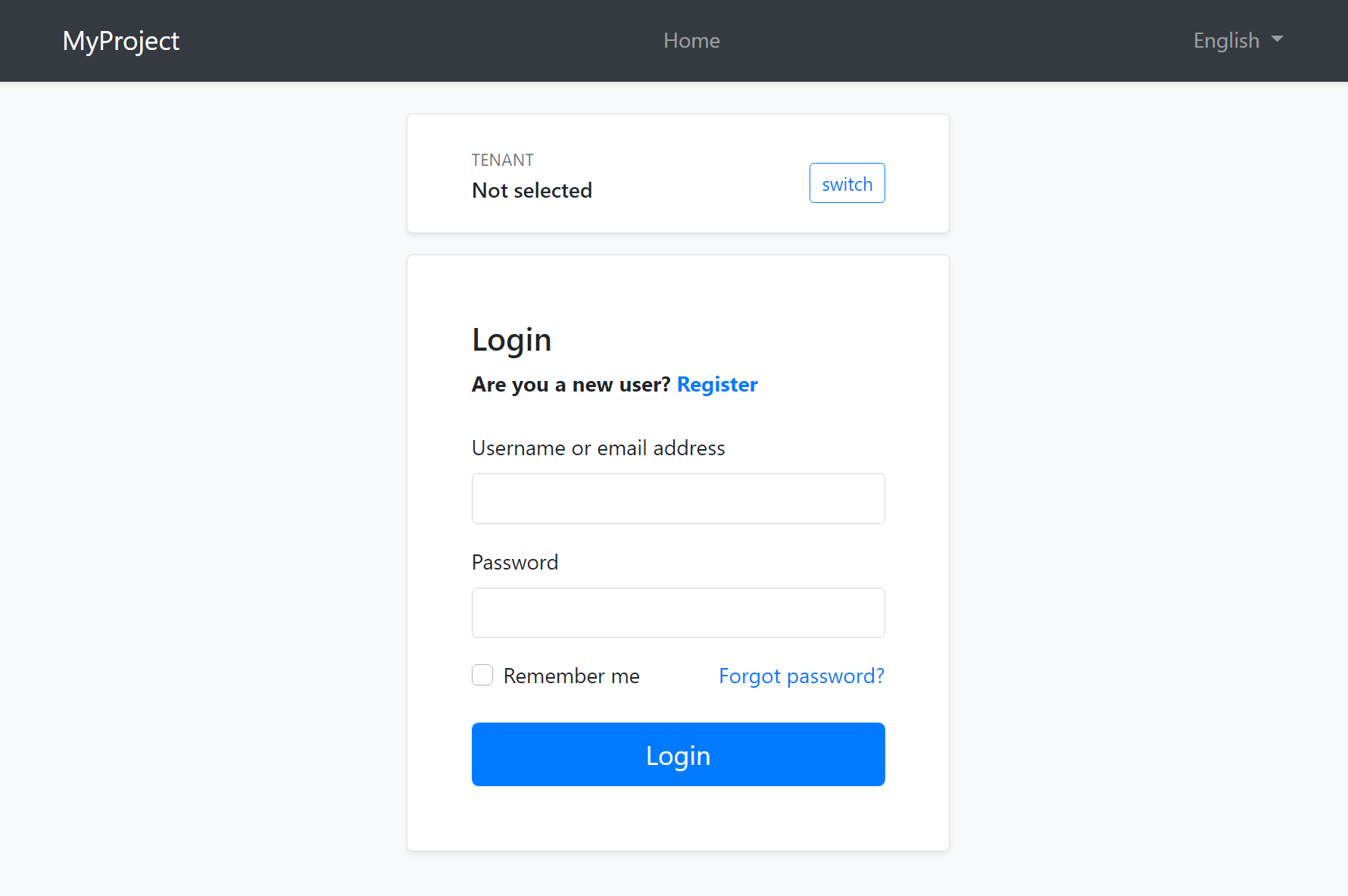
This layout typically provides the following parts;
- Language switch dropdown
- Tenant switch area (if the application is multi-tenant and the current is resolved by the cookie)
- Page alerts
- The page content (aka
RenderBody()) - Layout hooks
The Basic Theme renders the top navigation bar for this layout too (as shown above)
Here, the account layout of the Lepton Theme:

The Lepton Theme shows the application logo and footer in this layout.
You can override theme layouts completely or partially in an application to customize it.
The Empty Layout
The empty layout provides an empty page. It typically includes the following parts;
- Page alerts
- The page content (aka
RenderBody()) - Layout hooks
Implementing a Theme
The Easiest Way
The easiest way of creating a new theme is adding Basic Theme Source Code module with source codes and customizing it.
abp add-package Volo.Abp.AspNetCore.Mvc.UI.Theme.Basic --with-source-code --add-to-solution-file
The ITheme Interface
ITheme interface is used by the ABP Framework to select the layout for the current page. A theme must implement this interface to provide the requested layout path.
This is the ITheme implementation of the Basic Theme.
using Volo.Abp.AspNetCore.Mvc.UI.Theming;
using Volo.Abp.DependencyInjection;

namespace Volo.Abp.AspNetCore.Mvc.UI.Theme.Basic
{
    [ThemeName(Name)]
    public class BasicTheme : ITheme, ITransientDependency
    {
        public const string Name = "Basic";

        public virtual string GetLayout(string name, bool fallbackToDefault = true)
        {
            switch (name)
            {
                case StandardLayouts.Application:
                    return "~/Themes/Basic/Layouts/Application.cshtml";
                case StandardLayouts.Account:
                    return "~/Themes/Basic/Layouts/Account.cshtml";
                case StandardLayouts.Empty:
                    return "~/Themes/Basic/Layouts/Empty.cshtml";
                default:
                    return fallbackToDefault
                        ? "~/Themes/Basic/Layouts/Application.cshtml"
                        : null;
            }
        }
    }
}
[ThemeName]attribute is required and a theme must have a unique name,Basicin this sample.GetLayoutmethod should return a path if the requested layout (name) is provided by the theme. The Standard Layouts should be implemented if the theme is aimed to be used by a standard application. It may implement additional layouts.
Once the theme implements the ITheme interface, it should add the theme to the AbpThemingOptions in the ConfigureServices method of the module.
Configure<AbpThemingOptions>(options =>
{
    options.Themes.Add<BasicTheme>();
});
The IThemeSelector Service
ABP Framework allows to use multiple themes together. This is why options.Themes is a list. IThemeSelector service selects the theme on the runtime. The application developer can set the AbpThemingOptions.DefaultThemeName to set the theme to be used, or replace the IThemeSelector service implementation (the default implementation is DefaultThemeSelector) to completely control the theme selection on runtime.
Bundles
Bundling system provides a standard way to import style & script files into pages. There are two standard bundles defined by the ABP Framework:
StandardBundles.Styles.Global: The global bundle that includes the style files used in all the pages. Typically, it includes the CSS files of the Base Libraries.StandardBundles.Scripts.Global: The global bundle that includes the script files used in all the pages. Typically, it includes the JavaScript files of the Base Libraries.
A theme generally extends these standard bundles by adding theme specific CSS/JavaScript files.
The best way to define new bundles, inherit from the standard bundles and add to the AbpBundlingOptions as shown below (this code is from the Basic Theme):
Configure<AbpBundlingOptions>(options =>
{
    options
        .StyleBundles
        .Add(BasicThemeBundles.Styles.Global, bundle =>
        {
            bundle
                .AddBaseBundles(StandardBundles.Styles.Global)
                .AddContributors(typeof(BasicThemeGlobalStyleContributor));
        });

    options
        .ScriptBundles
        .Add(BasicThemeBundles.Scripts.Global, bundle =>
        {
            bundle
                .AddBaseBundles(StandardBundles.Scripts.Global)
                .AddContributors(typeof(BasicThemeGlobalScriptContributor));
        });
});
BasicThemeGlobalStyleContributor and BasicThemeGlobalScriptContributor are bundle contributors. For example, BasicThemeGlobalStyleContributor is defined as shown below:
public class BasicThemeGlobalStyleContributor : BundleContributor
{
    public override void ConfigureBundle(BundleConfigurationContext context)
    {
        context.Files.Add("/themes/basic/layout.css");
    }
}
Then the theme can render these bundles in a layout. For example, you can render the Global Styles as shown below:
<abp-style-bundle name="@BasicThemeBundles.Styles.Global" />
See the Bundle & Minification document to understand the Bundling system better.
Layout Parts
A typical Layout consists of several parts. The theme should include the necessary parts in each layout.
Example: The Basic Theme has the following parts for the Application Layout

The application code and the modules can only show contents in the Page Content part. If they need to change the other parts (to add a menu item, to add a toolbar item, to change the application name in the branding area...) they should use the ABP Framework APIs.
The following sections explain the fundamental parts pre-defined by the ABP Framework and can be implemented by the themes.
It is a good practice to split the layout into components/partials, so the final application can override them partially for customization purpose.
Branding
IBrandingProvider service should be used to get the name and the logo URL of the application to render in the Branding part.
The Application Startup Template has an implementation of this interface to set the values by the application developer.
Main Menu
IMenuManager service is used to get the main menu items and render on the layout.
Example: Get the Main Menu to render in a view component
public class MainNavbarMenuViewComponent : AbpViewComponent
{
    private readonly IMenuManager _menuManager;

    public MainNavbarMenuViewComponent(IMenuManager menuManager)
    {
        _menuManager = menuManager;
    }

    public async Task<IViewComponentResult> InvokeAsync()
    {
        var menu = await _menuManager.GetAsync(StandardMenus.Main);
        return View("~/Themes/Basic/Components/Menu/Default.cshtml", menu);
    }
}
See the Navigation / Menus document to learn more about the navigation system.
Main Toolbar
IToolbarManager service is used to get the Main Toolbar items and render on the layout. Each item of this toolbar is a View Component, so it may include any type of UI elements. Inject the IToolbarManager and use the GetAsync to get the toolbar items:
var toolbar = await _toolbarManager.GetAsync(StandardToolbars.Main);
See the Toolbars document to learn more on the toolbar system.
The theme has a responsibility to add two pre-defined items to the main toolbar: Language Selection and User Menu. To do that, create a class implementing the IToolbarContributor interface and add it to the AbpToolbarOptions as shown below:
Configure<AbpToolbarOptions>(options =>
{
    options.Contributors.Add(new BasicThemeMainTopToolbarContributor());
});
Language Selection
Language Selection toolbar item is generally a dropdown that is used to switch between languages. ILanguageProvider is used to get the list of available languages and CultureInfo.CurrentUICulture is used to learn the current language.
/Abp/Languages/Switch endpoint can be used to switch the language This endpoint accepts the following query string parameters:
culture: The selected culture, likeen-USoren.uiCulture: The selected UI culture, likeen-USoren.returnUrl(optional): Can be used to return a given URL after switching the language.
culture and uiCulture should match one of the available languages. ABP Framework sets a culture cookie in the /Abp/Languages/Switch endpoint.
User Menu
User menu includes links related to the user account. IMenuManager is used just like the Main Menu, but this time with StandardMenus.User parameter like shown below:
var menu = await _menuManager.GetAsync(StandardMenus.User);
ICurrentUser and ICurrentTenant services can be used to obtain the current user and tenant names.
Page Alerts
IAlertManager service is used to get the current page alerts to render on the layout. Use the Alerts list of the IAlertManager. It is generally rendered just before the page content (RenderBody()).
See the Page Alerts document to learn more.
Layout Hooks
Since the Layout is in the theme package, the final application or any module can't directly manipulate the layout content. The Layout Hook system allows to inject components to some specific points of the layout.
The theme is responsible to render the hooks in the correct place.
Example: Render the LayoutHooks.Head.First Hook in the Application Layout
<head>
    @await Component.InvokeLayoutHookAsync(LayoutHooks.Head.First, StandardLayouts.Application)
    ...
See the Layout Hook document to learn the standard layout hooks.
Script / Style Sections
Every layout should render the following optional sections:
stylessection is rendered in the end of thehead, just before theLayoutHooks.Head.Last.scriptssection is rendered in the end of thebody, just before theLayoutHooks.Body.Last.
In this way, the page can import styles and scripts to the layout.
Example: Render the styles section
@await RenderSectionAsync("styles", required: false)
Content Toolbar Section
Another pre-defined section is the Content Toolbar section which can be used by the pages to add code just before the page content. The Basic Theme renders it as shown below:
<div id="AbpContentToolbar">
    <div class="text-end mb-2">
        @RenderSection("content_toolbar", false)
    </div>
</div>
The container div's id must be AbpContentToolbar. This section should come before the RenderBody().
Widget Resources
The Widget System allows to define reusable widgets with their own style/script files. All the layouts should render the widget style and scripts.
Widget Styles is rendered as shown below, just before the styles section, after the global style bundle:
@await Component.InvokeAsync(typeof(WidgetStylesViewComponent))
Widget Scripts is rendered as shown below, just before the scripts section, after the global script bundle:
@await Component.InvokeAsync(typeof(WidgetScriptsViewComponent))
ABP Scripts
ABP has some special scripts those should be included into every layout. They are not included in the global bundles since they are dynamically created based on the current user.
ABP scripts (ApplicationConfigurationScript and ServiceProxyScript) should be added just after the global script bundle, as shown below:
<script src="~/Abp/ApplicationConfigurationScript"></script>
<script src="~/Abp/ServiceProxyScript"></script>
Page Title, Selected Menu Item and Breadcrumbs
IPageLayout service can be injected by any page to set the Page Title, the selected menu item name and the breadcrumb items. Then the theme can use this service to get these values and render on the UI.
The Basic Theme doesn't implement this service, but the Lepton Theme implements:

See the Page Header document for more.
Tenant Switch
The Account Layout should allow the user to switch the current tenant if the application is multi-tenant and the tenant was resolved from the cookies. See the Basic Theme Account Layout as an example implementation.
Layout Classes
The Standard Layouts (Application, Account and Empty) should add the following CSS classes to the body tag:
abp-application-layoutfor theApplicationlayout.abp-account-layoutfor theAccountlayout.abp-empty-layoutfor theEmptylayout.
In this way, applications or modules can have selectors based on the current layout.
RTL
To support Right-To-Left languages, the Layout should check the current culture and add dir="rtl" to the html tag and rtl CSS class the the body tag.
You can check CultureInfo.CurrentUICulture.TextInfo.IsRightToLeft to understand if the current language is a RTL language.
The NPM Package
A theme should have a NPM package that depends on the @abp/aspnetcore.mvc.ui.theme.shared package. In this way, it inherits all the Base Libraries. If the theme requires additional libraries, then it should define these dependencies too.
Applications use the Client Side Package Management system to add client side libraries to the project. So, if an application uses your theme, it should add dependency to your theme's NPM package as well as the NuGet package dependency.
 08-09 May


