ASP.NET Core MVC / Razor Pages UI: Toolbars
The Toolbar system is used to define toolbars on the user interface. Modules (or your application) can add items to a toolbar, then the theme renders the toolbar on the layout.
There is only one standard toolbar named "Main" (defined as a constant: StandardToolbars.Main). The Basic Theme renders the main toolbar as shown below:
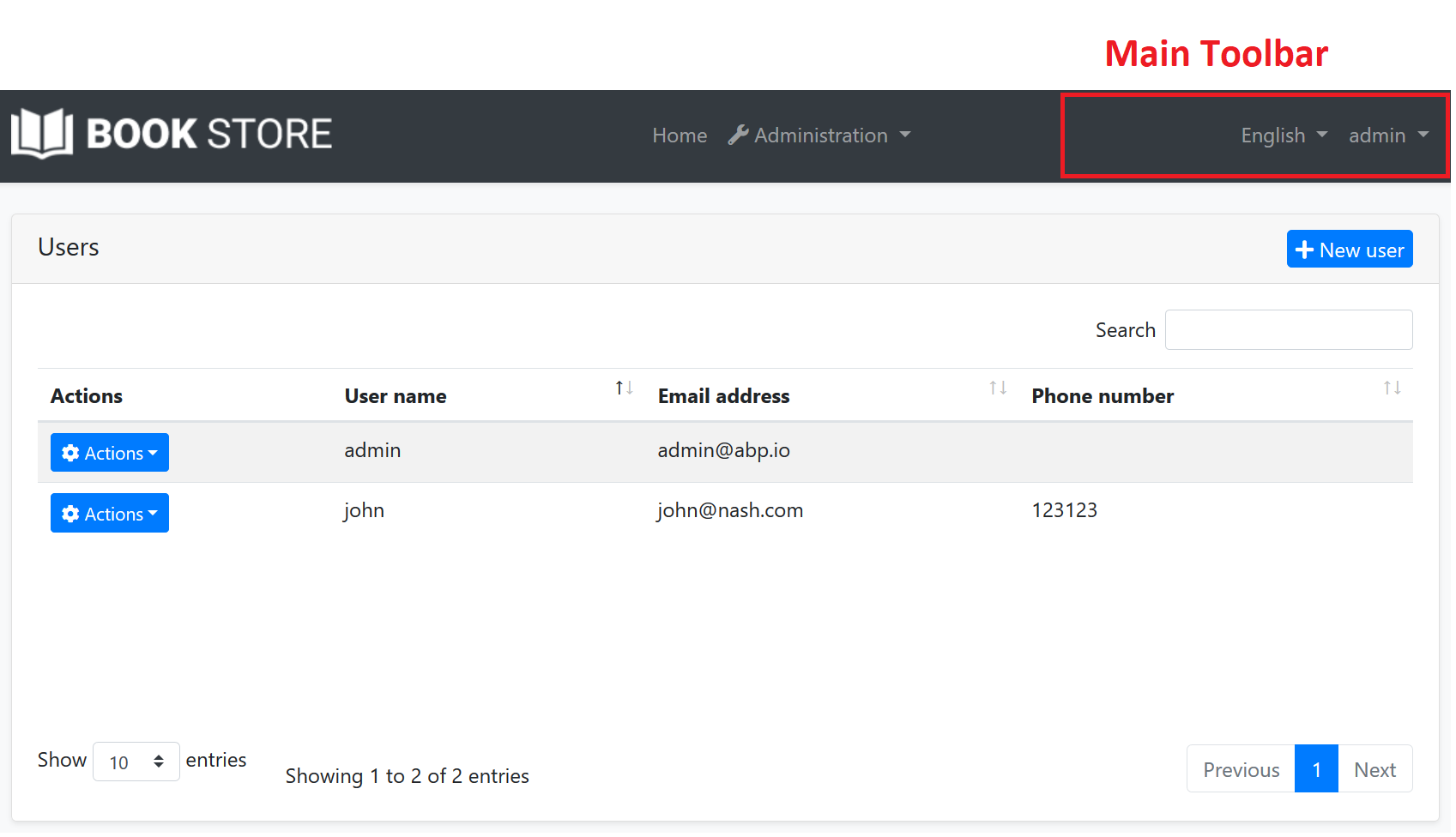
In the screenshot above, there are two items added to the main toolbar: Language switch component & user menu. You can add your own items here.
Example: Add a Notification Icon
In this example, we will add a notification (bell) icon to the left of the language switch item. A item in the toolbar should be a view component. So, first, create a new view component in your project:
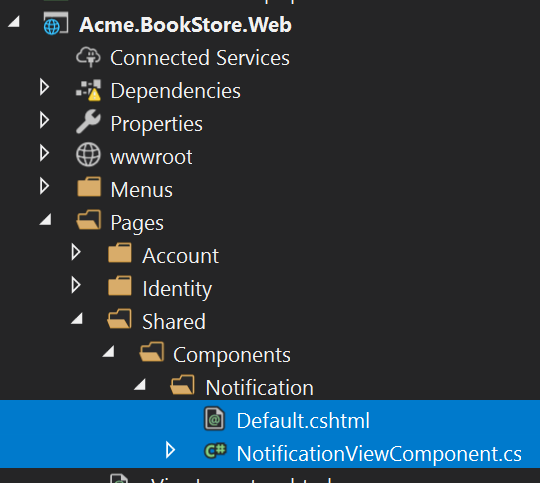
NotificationViewComponent.cs
public class NotificationViewComponent : AbpViewComponent
{
    public async Task<IViewComponentResult> InvokeAsync()
    {
        return View("/Pages/Shared/Components/Notification/Default.cshtml");
    }
}
Default.cshtml
<div id="MainNotificationIcon" style="color: white; margin: 8px;">
    <i class="far fa-bell"></i>
</div>
Now, we can create a class implementing the IToolbarContributor interface:
public class MyToolbarContributor : IToolbarContributor
{
    public Task ConfigureToolbarAsync(IToolbarConfigurationContext context)
    {
        if (context.Toolbar.Name == StandardToolbars.Main)
        {
            context.Toolbar.Items
                .Insert(0, new ToolbarItem(typeof(NotificationViewComponent)));
        }

        return Task.CompletedTask;
    }
}
You can use the authorization to decide whether to add a ToolbarItem.
if (await context.IsGrantedAsync("MyPermissionName"))
{
    //...add Toolbar items
}
You can use RequirePermissions extension method as a shortcut. It is also more performant, ABP optimizes the permission check for all the items.
context.Toolbar.Items.Insert(0, new ToolbarItem(typeof(NotificationViewComponent)).RequirePermissions("MyPermissionName"));
This class adds the NotificationViewComponent as the first item in the Main toolbar.
Finally, you need to add this contributor to the AbpToolbarOptions, in the ConfigureServices of your module:
Configure<AbpToolbarOptions>(options =>
{
    options.Contributors.Add(new MyToolbarContributor());
});
That's all, you will see the notification icon on the toolbar when you run the application:
NotificationViewComponent in this sample simply returns a view without any data. In real life, you probably want to query database (or call an HTTP API) to get notifications and pass to the view. If you need, you can add a JavaScript or CSS file to the global bundle for your toolbar item.
IToolbarManager
IToolbarManager is used to render the toolbar. It returns the toolbar items by a toolbar name. This is generally used by the themes to render the toolbar on the layout.
 08-09 May


