Angular UI: Theming
Introduction
ABP Framework provides a complete UI Theming system with the following goals:
- Reusable application modules are developed theme-independent, so they can work with any UI theme.
- UI theme is decided by the final application.
- The theme is distributed via an NPM package, so it is easily upgradable.
- The final application can customize the selected theme.
In order to accomplish these goals, ABP Framework;
- Determines a set of base libraries used and adapted by all the themes. So, module and application developers can depend on and use these libraries without depending on a particular theme.
- Provides a system that consists of layout parts (like navigation menus and toolbars) that is implemented by all the themes. So, the modules and the application contribute to the layout to compose a consistent application UI.
Current Themes
Currently, two themes are officially provided:
- The Basic Theme is the minimalist theme with the plain Bootstrap style. It is open source and free.
- The Lepton Theme is a commercial theme developed by the core ABP team and is a part of the ABP Commercial license.
Overall
The Base Libraries
All the themes must depend on the @abp/ng.theme.shared NuGet package, so they are indirectly depending on the following libraries:
- Twitter Bootstrap as the fundamental HTML/CSS framework.
- FontAwesome as the fundamental CSS font library.
- NG Bootstrap as a component library that supports the Bootstrap and adds extra components like modal and datepicker.
- Ngx-Datatable as a datatable library.
- ngx-validate a dynamic validation of reactive forms library.
- Chart.js as a widget library.
These libraries are selected as the base libraries and available to the applications and modules.
Bootstrap's JavaScript part is not used since the NG Bootstrap library already provides the necessary functionalities to the Bootstrap components in a native way.
The Layout
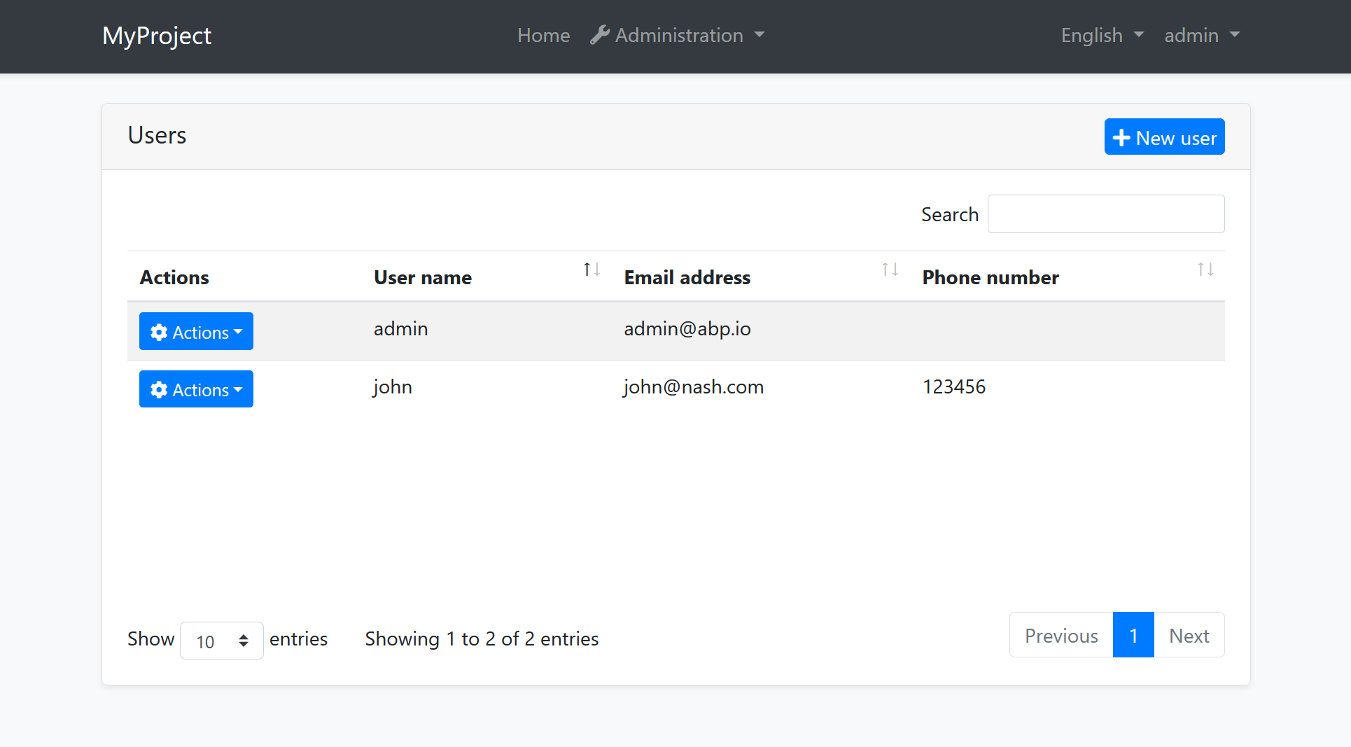
All themes must define a layout for the application. The following image shows the user management page in the Basic Theme application layout:
And the same page is shown below with the Lepton Theme application layout:
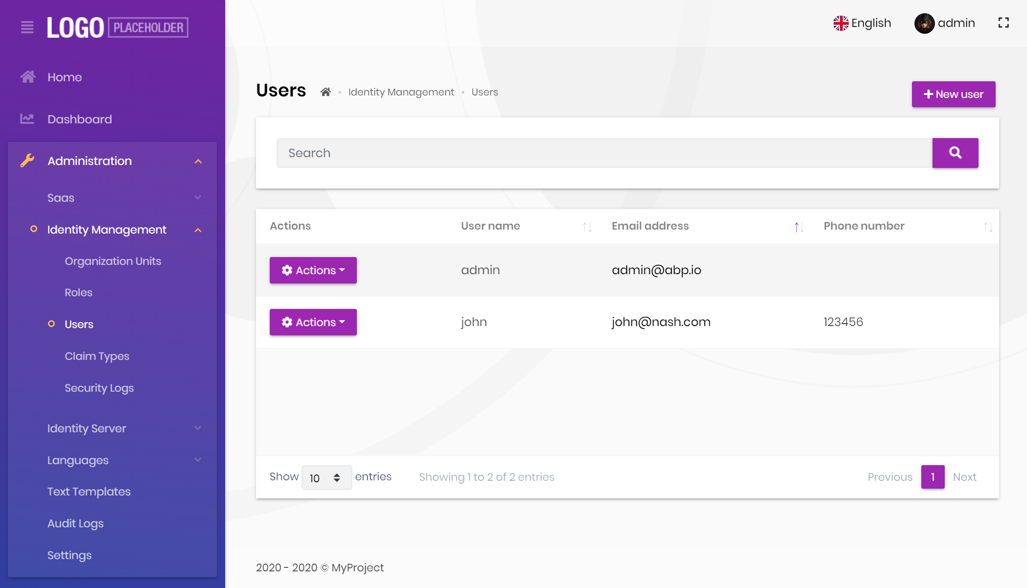
As you can see, the page is the same, but the look is completely different in the themes above.
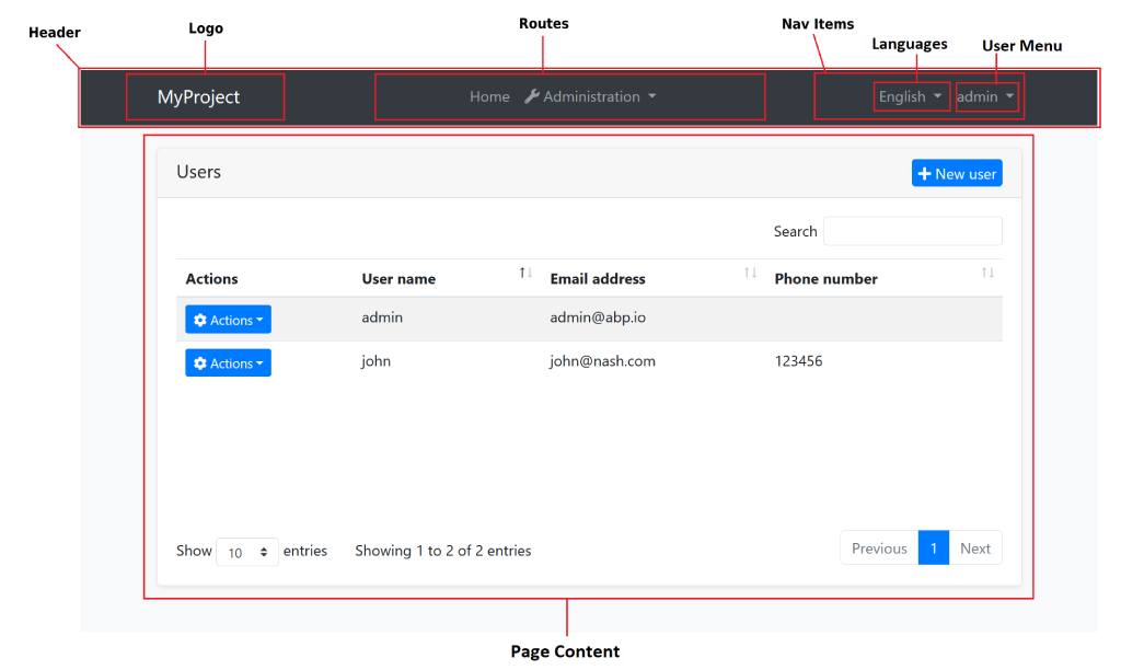
The application layout typically includes the following parts;
- Main menu
- Nav items area with the following components;
- User menu
- Language switch dropdown
- Page alerts
- The page content (aka
<router-outlet>)
Implementing a Theme
A theme is simply an NPM package and comes with startup templates.
The Easy Way
The easiest way to create a new theme is to add Basic Theme Source Code to your project via ABP CLI command and customize it.
You can run the following command in Angular project directory to copy the source code to your solution:
abp add-package @abp/ng.theme.basic --with-source-code
Global/Component Styles
Angular can bundle global style files and component styles with components. See the component styles guide on Angular documentation for more information.
Layout Parts
A typical layout consists of several parts. The theme should include the necessary parts in each layout.
Example: The Basic Theme has the following parts for the Application Layout
The application code and the modules can only show contents in the Page Content part. If they need to change the other parts (to add a menu item, to add a nav item, to change the application name in the logo area...) they should use the ABP Framework APIs.
The following sections explain the fundamental parts pre-defined by the ABP Framework and can be implemented by the themes.
It is a good practice to split the layout into components/partials, so the final application can override them partially for customization purpose.
Logo
The application object of an environment file should be configured to get the name and the logo URL of the application to render in the logo part. Additionally, LogoComponent can be replaced. See Component Replacement document for more.
The Application Startup Template has an implementation of this interface to set the values by the application developer.
Main Menu / Routes
RoutesService service is used to manage the main menu items and render them on the layout.
Example: Adding a route to the main menu
import { RoutesService, eLayoutType } from '@abp/ng.core';
import { Component } from '@angular/core';

@Component(/* component metadata */)
export class AppComponent {
  constructor(routes: RoutesService) {
    routes.add([
      {
        path: '/your-path',
        name: 'Your navigation',
        order: 101,
        iconClass: 'fas fa-question-circle',
        requiredPolicy: 'permission key here',
        layout: eLayoutType.application,
      },
      {
        path: '/your-path/child',
        name: 'Your child navigation',
        parentName: 'Your navigation',
        order: 1,
        requiredPolicy: 'permission key here',
      },
    ]);
  }
}
See the Modifying the Menu document to learn more about the navigation system.
Toolbar / Nav Items
NavItemsService service is used to get the menu's right part items and render on the layout. You can add an HTML content or Angular component as an element to render.
Example: Adding an element to right part of the menu
import { NavItemsService } from '@abp/ng.theme.shared';
import { Component } from '@angular/core';

@Component({
  template: `
    <input type="search" placeholder="Search" class="bg-transparent border-0 color-white" />
  `,
})
export class MySearchInputComponent {}


@Component(/* component metadata */)
export class AppComponent {
  constructor(private navItems: NavItemsService) {
    navItems.addItems([
      {
        id: 'MySearchInput',
        order: 1,
        component: MySearchInputComponent,
      },
      {
        id: 'SignOutIcon',
        html: '<i class="fas fa-sign-out-alt fa-lg text-white m-2"><i>',
        action: () => console.log('Clicked the sign out icon'),
        order: 101, // puts as last element
      },
    ]);
  }
}
See the How to Add an Element to Right Part of the Menu document to learn more on the nav items system.
The theme has a responsibility to add two pre-defined items to the toolbar: Language Selection and User Menu.
Language Selection
Language Selection toolbar item is generally a dropdown that is used to switch between languages. ConfigStateService is used to get the list of available languages and SessionStateService is used to learn the current language.
SessionStateService is used to get and set the current language.
Example: Get the currently selected language
import {SessionStateService} from '@abp/ng.core';

//...

constructor(private sessionState: SessionStateService) {
    const lang = this.sessionState.getLanguage()
}
Example: Set the selected language
import {SessionStateService} from '@abp/ng.core';

//...

constructor(private sessionState: SessionStateService) {
    const lang = this.sessionState.setLanguage('en')
}
User Menu
UserMenuService is used to get the user menu's items and render on the dropdown. You can add/update/remove an item by using the service.
You can either pass a component, a piece of html or a textTemplate to render an item.
All of the options are shown below. You can choose either of them.
Example: Adding/updating/removing an user menu item
import { eUserMenuItems } from '@abp/ng.theme.basic';
import { UserMenuService } from '@abp/ng.theme.shared';
import { Component } from '@angular/core';
import { Router } from '@angular/router';

// make sure that you import this component in a NgModule
@Component({
  selector: 'abp-current-user-test',
  template: `
    <a class="dropdown-item pointer" (click)="data.action()">
      <i *ngIf="data.textTemplate.icon" [class]="data.textTemplate.icon"></i>
      {{ data.textTemplate.text | abpLocalization }}
    </a>
  `,
})
export class UserMenuItemComponent {
  // you can inject the data through `INJECTOR_PIPE_DATA_TOKEN` token
  constructor(@Inject(INJECTOR_PIPE_DATA_TOKEN) public data: UserMenu) {}
}

@Component({/* component metadata */})
export class AppComponent {
  constructor(private userMenu: UserMenuService, private router: Router) {
    this.userMenu.addItems([
      {
        id: 'UserMenu.MyAccount',
        order: 1,

        // HTML example
        html: `<a class="dropdown-item pointer">My account</a>`,

        // text template example
        textTemplate: {
          text: 'AbpAccount::MyAccount',
          icon: 'fa fa-cog',
        },
        // component example
        component: UserMenuItemComponent,

        action: () => {
          this.router.navigateByUrl('/account/manage');
        },
      },
    ]);

    this.userMenu.patchItem(eUserMenuItems.MyAccount, {
      html: `<a class="dropdown-item pointer">My profile</a>`,
    });

    this.userMenu.removeItem(eUserMenuItems.Logout);
  }
}
In the example above, added a new user menu item labeled "Reports", updated the "My account" item HTML content, and removed the "Logout" item.
See the result:

Page Alerts
PageAlertService service is used to get the current page alerts to render on the layout. See the Page Alerts document to learn more.
 08-09 May


