Modal
ModalComponent is a pre-built component exposed by @abp/ng.theme.shared package to show modals. The component uses the ng-bootstrap's modal service inside to render a modal.
The abp-modal provides some additional benefits:
- It is flexible. You can pass header, body, footer templates easily by adding the templates to the
abp-modalcontent. It can also be implemented quickly. - Provides several inputs be able to customize the modal and several outputs be able to listen to some events.
- Automatically detects the close button which has a
abpClosedirective attached to and closes the modal when pressed this button. - Automatically detects the
abp-buttonand triggers its loading spinner when thebusyinput value of the modal component is true. - Automatically checks if the form inside the modal has changed, but not saved. It warns the user by displaying a confirmation popup in this case when a user tries to close the modal or refresh/close the tab of the browser.
Note: A modal can also be rendered by using the
ng-bootstrapmodal. For further information, see Modal doc on theng-bootstrapdocumentation.
Getting Started
In order to use the abp-modal in an HTML template, the ThemeSharedModule should be imported into your module like this:
// ...
import { ThemeSharedModule } from '@abp/ng.theme.shared';

@NgModule({
  //...
  imports: [..., ThemeSharedModule],
})
export class MyFeatureModule {}
Usage
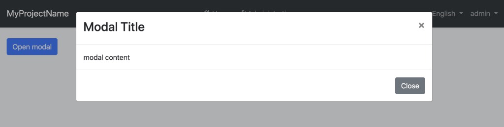
You can add the abp-modal to your component very quickly. See an example:
<!-- sample.component.html -->

<button class="btn btn-primary" (click)="isModalOpen = true">Open modal</button>

<abp-modal [(visible)]="isModalOpen">
  <ng-template #abpHeader>
    <h3>Modal Title</h3>
  </ng-template>

  <ng-template #abpBody>
  <p>Modal content</p>
  </ng-template>

  <ng-template #abpFooter>
    <button type="button" class="btn btn-secondary" abpClose>Close</button>
  </ng-template>
</abp-modal>
// sample.component.ts

@Component(/* component metadata */)
export class SampleComponent {
    isModalOpen = false
}
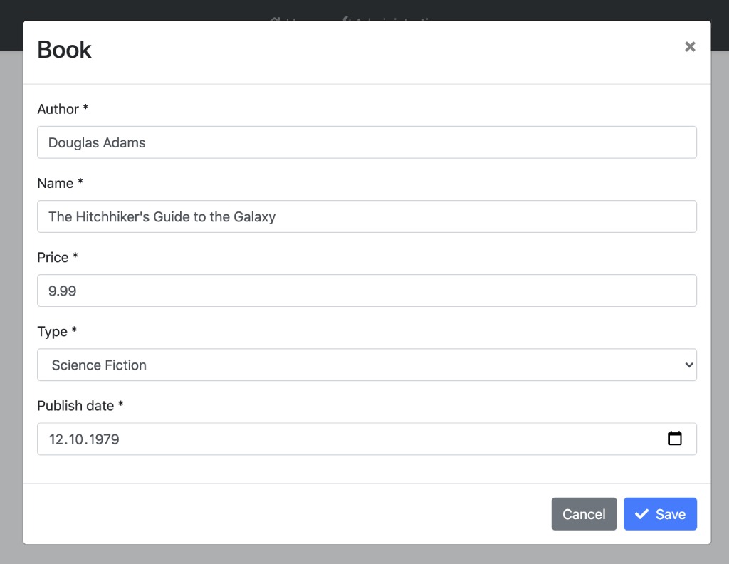
See an example form inside a modal:
<!-- book.component.ts -->

<abp-modal [(visible)]="isModalOpen" [busy]="inProgress">
  <ng-template #abpHeader>
    <h3>Book</h3>
  </ng-template>

  <ng-template #abpBody>
    <form id="book-form" [formGroup]="form" (ngSubmit)="save()">
      <div class="form-group">
        <label for="book-name">Author</label><span> * </span>
        <input type="text" id="author" class="form-control" formControlName="author" autofocus />
      </div>

      <div class="form-group">
        <label for="book-name">Name</label><span> * </span>
        <input type="text" id="book-name" class="form-control" formControlName="name" />
      </div>

      <div class="form-group">
        <label for="book-price">Price</label><span> * </span>
        <input type="number" id="book-price" class="form-control" formControlName="price" />
      </div>

      <div class="form-group">
        <label for="book-type">Type</label><span> * </span>
        <select class="form-control" id="book-type" formControlName="type">
          <option [ngValue]="null">Select a book type</option>
          <option [ngValue]="0">Undefined</option>
          <option [ngValue]="1">Adventure</option>
          <option [ngValue]="2">Biography</option>
          <option [ngValue]="3">Fantastic</option>
          <option [ngValue]="4">Science</option>
        </select>
      </div>

      <div class="form-group">
        <label for="book-publish-date">Publish date</label><span> * </span>
        <input
          id="book-publish-date"
          formControlName="publishDate"
          class="form-control"
          type="date"
        />
      </div>
    </form>
  </ng-template>

  <ng-template #abpFooter>
    <button type="button" class="btn btn-secondary" abpClose>
      Cancel
    </button>

    <button form="book-form" class="btn btn-primary" [disabled]="form.invalid || form.pristine">
      <i class="fa fa-check mr-1"></i>
      Save
    </button>
  </ng-template>
</abp-modal>
// book.component.ts

import { Component } from '@angular/core';
import { FormBuilder, Validators } from '@angular/forms';

@Component(/* component metadata */)
export class BookComponent {
 form = this.fb.group({
    author: [null, [Validators.required]],
    name: [null, [Validators.required]],
    price: [null, [Validators.required, Validators.min(0)]],
    type: [null, [Validators.required]],
    publishDate: [null, [Validators.required]],
  });

  inProgress: boolean;

  isModalOpen: boolean;

  constructor(private fb: FormBuilder, private service: BookService) {}

  save() {
    if (this.form.invalid) return;

    this.inProgress = true;

    this.service.save(this.form.value).subscribe(() => {
      this.inProgress = false;
    });
  }
}
The modal with form looks like this:
API
Inputs
visible
@Input() visible: boolean
visible is a boolean input that determines whether the modal is open. It is also can be used two-way binding.
busy
@Input() busy: boolean
busy is a boolean input that determines whether the busy status of the modal is true. When busy is true, the modal cannot be closed and the abp-button loading spinner is triggered.
options
@Input() options: NgbModalOptions
options is an input typed NgbModalOptions. It is configuration for the ng-bootstrap modal.
suppressUnsavedChangesWarning
@Input() suppressUnsavedChangesWarning: boolean
suppressUnsavedChangesWarning is a boolean input that determines whether the confirmation popup triggering active or not. It can also be set globally as shown below:
//app.module.ts

// app.module.ts

import { SUPPRESS_UNSAVED_CHANGES_WARNING } from '@abp/ng.theme.shared';

// ...

@NgModule({
  // ...
  providers: [{provide: SUPPRESS_UNSAVED_CHANGES_WARNING, useValue: true}]
})
export class AppModule {}
Note: The suppressUnsavedChangesWarning input of abp-modal value overrides the SUPPRESS_UNSAVED_CHANGES_WARNING injection token value.
Outputs
visibleChange
@Output() readonly visibleChange = new EventEmitter<boolean>();
visibleChange is an event emitted when the modal visibility has changed. The event payload is a boolean.
appear
@Output() readonly appear = new EventEmitter<void>();
appear is an event emitted when the modal has opened.
disappear
@Output() readonly disappear = new EventEmitter<void>();
disappear is an event emitted when the modal has closed.
 08-09 May


