LeptonX Lite MVC UI
LeptonX Lite has implementation for the ABP Framework Razor Pages. It's a simplified variation of the LeptonX Theme.
If you are looking for a professional, enterprise ready theme, you can check the LeptonX Theme, which is a part of ABP Commercial.
See the Theming document to learn about themes.
Installation
This theme is already installed when you create a new solution using the startup templates. If you are using any other template, you can install this theme by following the steps below:
- Add the Volo.Abp.AspNetCore.Mvc.UI.Theme.LeptonXLite package to your Web application.
dotnet add package Volo.Abp.AspNetCore.Mvc.UI.Theme.LeptonXLite --prerelease
Remove the Volo.Abp.AspNetCore.Mvc.UI.Theme.Basic reference from the project since it's not necessary after switching to LeptonX Lite.
Make sure the old theme is removed and LeptonX is added in your Module class.
[DependsOn(
     // Remove the BasicTheme module from DependsOn attribute
-    typeof(AbpAspNetCoreMvcUiBasicThemeModule),

     // Add the LeptonX Lite module to DependsOn attribute
+    typeof(AbpAspNetCoreMvcUiLeptonXLiteThemeModule),
)]
- Replace
BasicThemeBundleswithLeptonXLiteThemeBundlesin AbpBundlingOptions
Configure<AbpBundlingOptions>(options =>
{
    options.StyleBundles.Configure(
        // Remove the following line
-       BasicThemeBundles.Styles.Global,
        // Add the following line instead
+       LeptonXLiteThemeBundles.Styles.Global
        bundle =>
        {
            bundle.AddFiles("/global-styles.css");
        }
    );
});
Customization
Layouts
LeptonX Lite Mvc provides layouts for your user interface based ABP Framework Theming. You can use layouts to organize your user interface.
The main responsibility of a theme is to provide the layouts. There are three pre-defined layouts that must be implemented by all the themes:
Application: The default layout which is used by the main application pages.
Account: Mostly used by the account module for login, register, forgot password... pages.
Empty: The Minimal layout that has no layout components at all.
Layout names are constants defined in the LeptonXLiteTheme class in the Mvc project root.
The layout pages define under the
Themes/LeptonXLite/Layoutsfolder and you can override it by creating a file with the same name and under the same folder.
Toolbars
LeptonX Lite includes separeted toolbars for desktop & mobile. You can manage toolbars independently. Toolbar names can be accessible in the LeptonXLiteToolbars class.
LeptonXLiteToolbars.MainLeptonXLiteToolbars.MainMobile
public class MyProjectNameMainToolbarContributor : IToolbarContributor
{
    public async Task ConfigureToolbarAsync(IToolbarConfigurationContext context)
    {
        if (context.Toolbar.Name == LeptonXLiteToolbars.Main)
        {
            context.Toolbar.Items.Add(new ToolbarItem(typeof(MyDesktopComponent)));
        }

        if (context.Toolbar.Name == LeptonXLiteToolbars.MainMobile)
        {
            context.Toolbar.Items.Add(new ToolbarItem(typeof(MyMobileComponent)));
        }
    }
}
LeptonX Lite Mvc Components
Abp helps you make highly customizable UI. You can easily customize your themes to fit your needs. The Virtual File System makes it possible to manage files that do not physically exist on the file system (disk). It's mainly used to embed (js, css, image..) files into assemblies and use them like physical files at runtime. An application (or another module) can override a virtual file of a module just like placing a file with the same name and extension into the same folder of the virtual file.
LeptonX Lite is built on the Abp Framework, so you can easily customize your Asp.Net Core Mvc user interface by following Abp Mvc UI Customization.
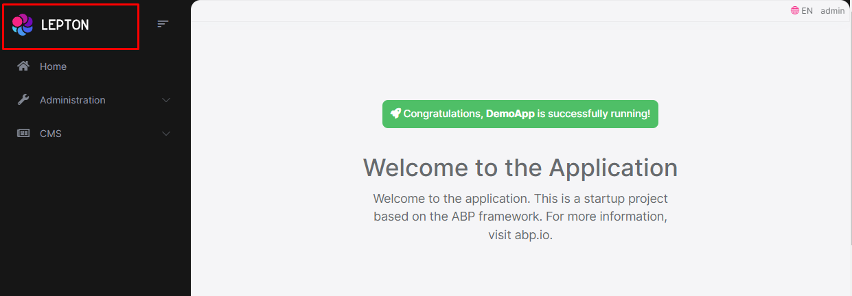
Brand Component
The brand component is a simple component that can be used to display your brand. It contains a logo and a company name.
How to override the Brand Component in LeptonX Lite Mvc
The brand component page (.cshtml file) is defined in the
Themes/LeptonXLite/Components/Brand/Default.cshtmlfile and you can override it by creating a file with the same name and under the same folder.The brand component (C# file) is defined in the
Themes/LeptonXLite/Components/Brand/MainNavbarBrandViewComponent.csfile and you can override it by creating a file with the same name and under the same folder.
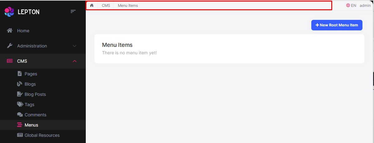
Breadcrumb Component
On websites that have a lot of pages, breadcrumb navigation can greatly enhance the way users find their way around. In terms of usability, breadcrumbs reduce the number of actions a website visitor needs to take in order to get to a higher-level page, and they improve the findability of website sections and pages.
How to override the Breadcrumb Component in LeptonX Lite Mvc
The breadcrumb component page (.cshtml file) is defined in the
Themes/LeptonXLite/Components/Breadcrumbs/Default.cshtmlfile and you can override it by creating a file with the same name and under the same folder.The breadcrumb component (C# file) is defined in the
Themes/LeptonXLite/Components/Breadcrumbs/BreadcrumbsViewComponent.csfile and you can override it by creating a file with the same name and under the same folder.
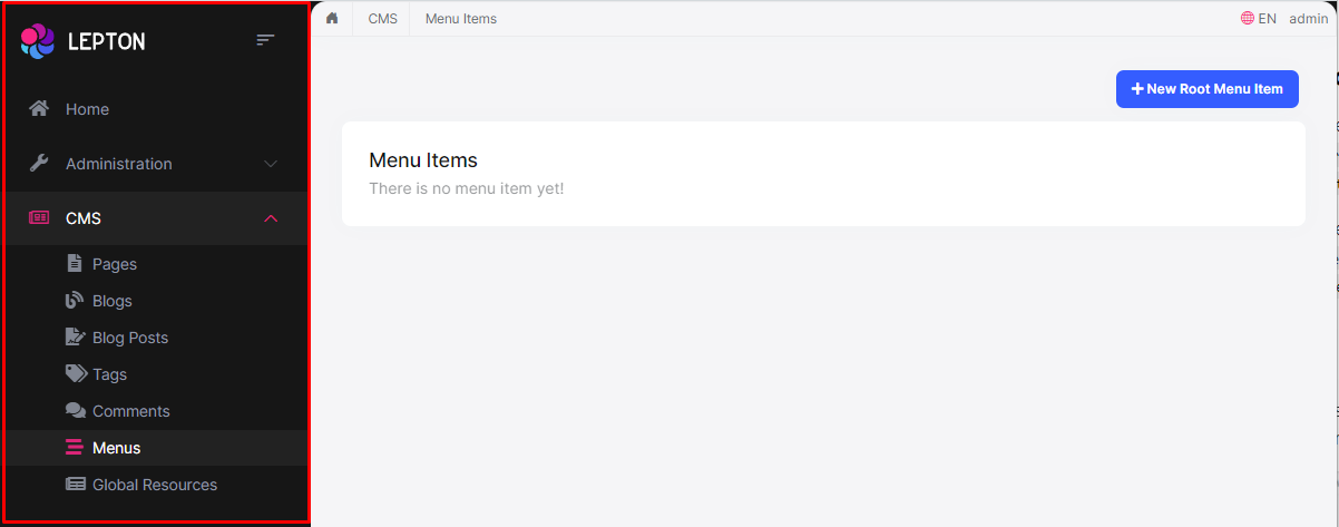
Sidebar Menu Component
Sidebar menus have been used as a directory for Related Pages to a Service offering, Navigation items to a specific service or topic and even just as Links the user may be interested in.
How to override the Sidebar Menu Component in LeptonX Lite Mvc
Sidebar menu page (.cshtml) is defined in the
Themes/LeptonXLite/Components/Menu/Default.cshtmlfile and you can override it by creating a file with the same name and under the same folder.If you want to override the menu component (C#) you can override the
Themes/LeptonXLite/Components/Menu/MainMenuViewComponent.csfile and you can override it by creating a file with the same name and under the same folder.
The sidebar menu renders menu items dynamically. The menu item is a partial view and is defined in the
Themes/LeptonXLite/Components/Menu/_MenuItem.cshtmlfile and you can override it by creating a file with the same name and under the same folder.
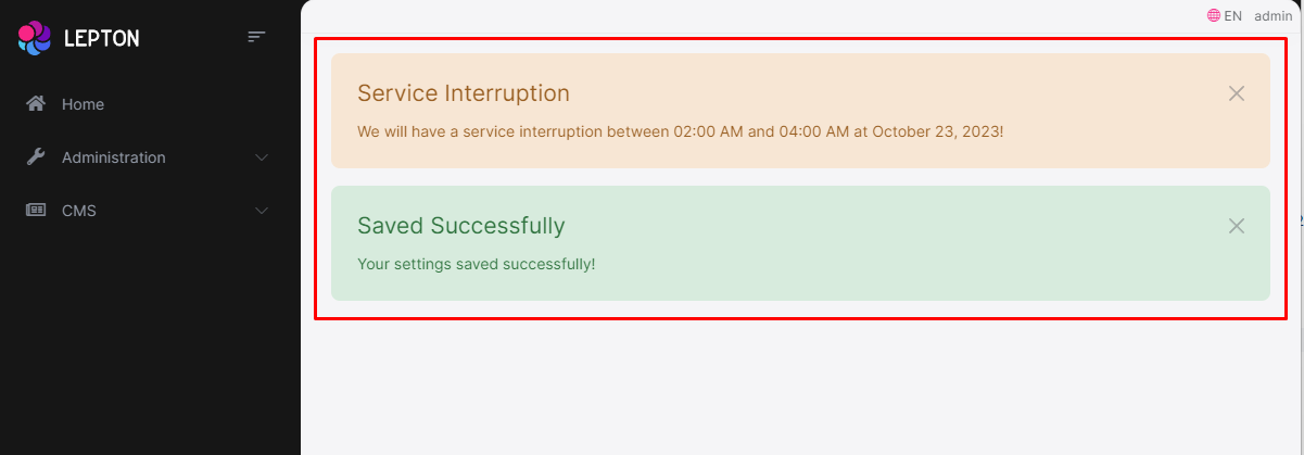
Page Alerts Component
Provides contextual feedback messages for typical user actions with the handful of available and flexible alert messages. Alerts are available for any length of text, as well as an optional dismiss button.
How to override the Page Alerts Component in LeptonX Lite Mvc
The page alerts component page (.cshtml file) is defined in the
Themes/LeptonXLite/Components/PageAlerts/Default.cshtmlfile and you can override it by creating a file with the same name and under the same folder.The page alerts component (C#) is defined in the
Themes/LeptonXLite/Components/PageAlerts/PageAlertsViewComponent.csfile and you can override it by creating a file with the same name and under the same folder.
Toolbar Component
Toolbar items are used to add extra functionality to the toolbar. The toolbar is a horizontal bar that contains a group of toolbar items.
How to override the Toolbar Component in LeptonX Lite Mvc
The toolbar component page (.cshtml file) is defined in the
Themes/LeptonXLite/Components/Toolbar/Default.cshtmlfile and you can override it by creating a file with the same name and under the same folder.The toolbar component (C#) is defined in the
Themes/LeptonXLite/Components/Toolbar/ToolbarViewComponent.csfile and you can override it by creating a file with the same name and under the same folder.
Toolbar Item Component
The toolbar item is a single item that contains a link, an icon, a label etc..
How to override the Toolbar Item Component in LeptonX Lite Mvc
The toolbar item component page (.cshtml file) is defined in the
Themes/LeptonXLite/Components/ToolbarItems/Default.cshtmlfile and you can override it by creating a file with the same name and under the same folder.The toolbar item component (C#) is defined in the
Themes/LeptonXLite/Components/ToolbarItems/ToolbarItemsViewComponent.csfile and you can override it by creating a file with the same name and under the same folder.
You can find the toolbar components below:
Language Switch Component
Think about a multi-lingual website and the first thing that could hit your mind is the language switch component. A navigation bar is a great place to embed a language switch. By embedding the language switch in the navigation bar of your website, you would make it simpler for users to find it and easily switch the language without trying to locate it across the website.
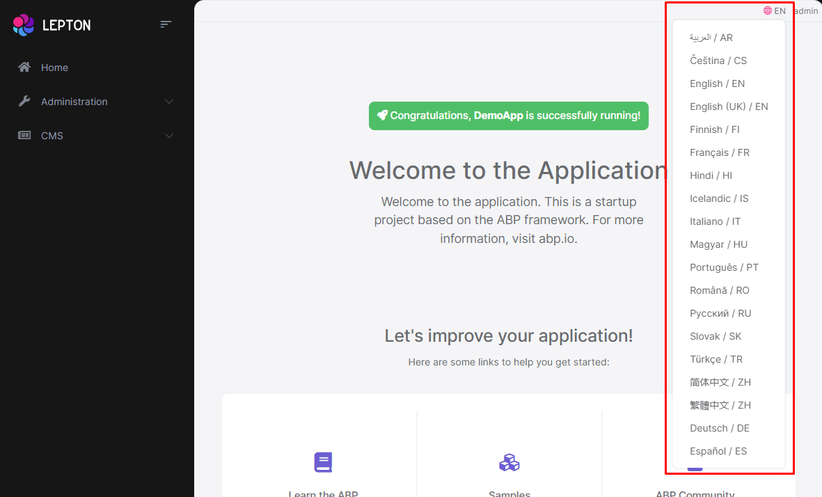
How to override the Language Switch Component in LeptonX Lite Mvc
The language switch component page (.cshtml file) is defined in the
Themes/LeptonXLite/Components/LanguageSwitch/Default.cshtmlfile and you can override it by creating a file with the same name and under the same folder.The language switch component (C#) is defined in the
Themes/LeptonXLite/Components/LanguageSwitch/LanguageSwitchViewComponent.csfile and you can override it by creating a file with the same name and under the same folder.
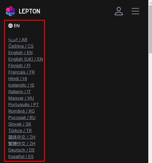
Mobile Language Switch Component
The mobile language switch component is used to switch the language of the website on mobile devices. The mobile language switch component is a dropdown menu that contains all the languages of the website.
How to override the Mobile Language Switch Component in LeptonX Lite Mvc
The mobile language switch component page (.cshtml file) is defined in the
Themes/LeptonXLite/Components/MobileLanguageSwitch/Default.cshtmlfile and you can override it by creating a file with the same name and under the same folder.The mobile language switch component (C#) is defined in the
Themes/LeptonXLite/Components/MobileLanguageSwitch/MobileLanguageSwitchViewComponent.csfile and you can override it by creating a file with the same name and under the same folder.
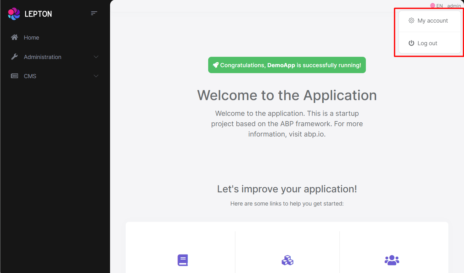
User Menu Component
The User Menu is the menu that drops down when you click your name or profile picture in the upper right corner of your page (in the toolbar). It drops down options such as Settings, Logout, etc.
How to override the User Menu Component in LeptonX Lite Mvc
The user menu component page (.cshtml file) is defined in the
Themes/LeptonXLite/Components/UserMenu/Default.cshtmlfile and you can override it by creating a file with the same name and under the same folder.The user menu component (C#) is defined in the
Themes/LeptonXLite/Components/UserMenu/UserMenuViewComponent.csfile and you can override it by creating a file with the same name and under the same folder.
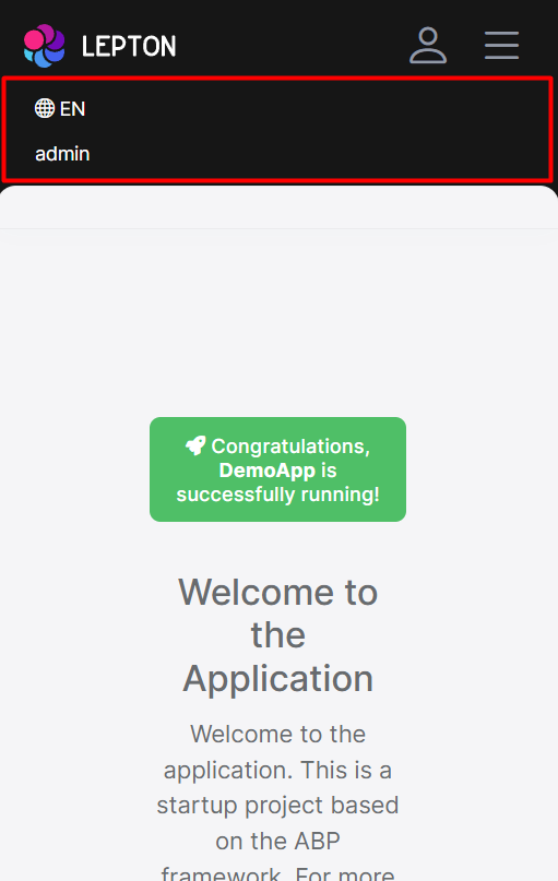
Mobile User Menu Component
The mobile user menu component is used to display the user menu on mobile devices. The mobile user menu component is a dropdown menu that contains all the options of the user menu.
How to override the Mobile User Menu Component in LeptonX Lite Mvc
The mobile user menu component page (.cshtml file) is defined in the
Themes/LeptonXLite/Components/MobileUserMenu/Default.cshtmlfile and you can override it by creating a file with the same name and under the same folder.The mobile user menu component (C#) is defined in the
Themes/LeptonLite/Components/MobileUserMenu/MobileUserMenuViewComponent.csfile and you can override it by creating a file with the same name and under the same folder.
 08-09 May


