ASP.NET Core MVC / Razor Pages: Auto-Complete Select
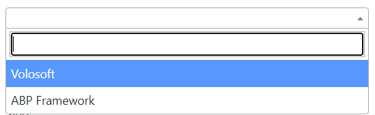
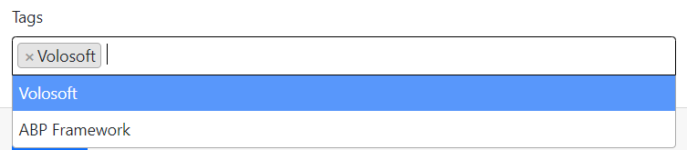
A simple select component sometimes isn't useful with a huge amount of data. ABP Provides a select implementation that works with pagination and server-side search via using Select2. It works with single or multiple choices well.
A screenshot can be shown below.
| Single | Multiple |
|---|---|
 |
 |
Getting Started
This is a core feature and it's used by the ABP Framework. There is no custom installation or additional packages required.
Usage
A simple usage is presented below.
<select asp-for="Book.AuthorId"
    class="auto-complete-select"
    data-autocomplete-api-url="/api/app/author"
    data-autocomplete-display-property="name"
    data-autocomplete-value-property="id"
    data-autocomplete-items-property="items"
    data-autocomplete-filter-param-name="filter"
    data-autocomplete-allow-clear="true">

    <!-- You can define selected option(s) here  -->
    <option selected value="@SelectedAuthor.Id">@SelectedAuthor.Name</option>
</select>
The select must have the auto-complete-select class and the following attributes:
data-autocomplete-api-url: * API Endpoint url to get select items. GET request will be sent to this url.data-autocomplete-display-property: * Property name to display. (For example:nameortitle. Property name of entity/dto.).data-autocomplete-value-property: * Identifier property name. (For example:id).data-autocomplete-items-property: * Property name of collection in response object. (For example:items)data-autocomplete-filter-param-name: * Filter text property name. (For example:filter).data-autocomplete-selected-item-name: Text to display as selected item.data-autocomplete-parent-selector: jQuery selector expression for parent DOM. (If it's in a modal, it's suggested to send the modal selector as this parameter).data-autocomplete-allow-clear: Iftrue, it'll allow to clear the selected value. Default value:false.data-autocomplete-placeholder: Placeholder text to display when no value is selected.
Also, selected value(s) should be defined with the <option> tags inside select, since pagination is applied and the selected options might haven't loaded yet.
Multiple Choices
AutoComplete Select supports multiple choices. If the select tag has a multiple attribute, it'll allow to choose multiple options.
<select asp-for="Book.TagIds"
    class="auto-complete-select"
    multiple="multiple"
    data-autocomplete-api-url="/api/app/tags"
    data-autocomplete-display-property="name"
    data-autocomplete-value-property="id"
    data-autocomplete-items-property="items"
    data-autocomplete-filter-param-name="filter">
    @foreach(var tag in SelectedTags)
    {
        <option selected value="@tag.Id">@tag.Name</option>
    }
</select>
It'll be automatically bound to a collection of defined value type.
public List<Guid> TagIds { get; set; }
Notices
If the authenticated user doesn't have permission on the given URL, the user will get an authorization error. Be careful while designing this kind of UIs. You can create a specific, unauthorized endpoint/method to get the list of items, so the page can retrieve lookup data of dependent entity without giving the entire read permission to users.
 08-09 May


