Blazor UI: Customization / Overriding Components
This document explains how to override the user interface of a depended application module or theme for Blazor applications.
Overriding a Razor Component
The ABP Framework, pre-built themes and modules define some re-usable razor components and pages. These pages and components can be replaced by your application or module.
Since pages are just the razor components, the same principle is valid for pages too.
Example: Replacing the Branding Area
The screenshot below was taken from the Basic Theme comes with the application startup template.
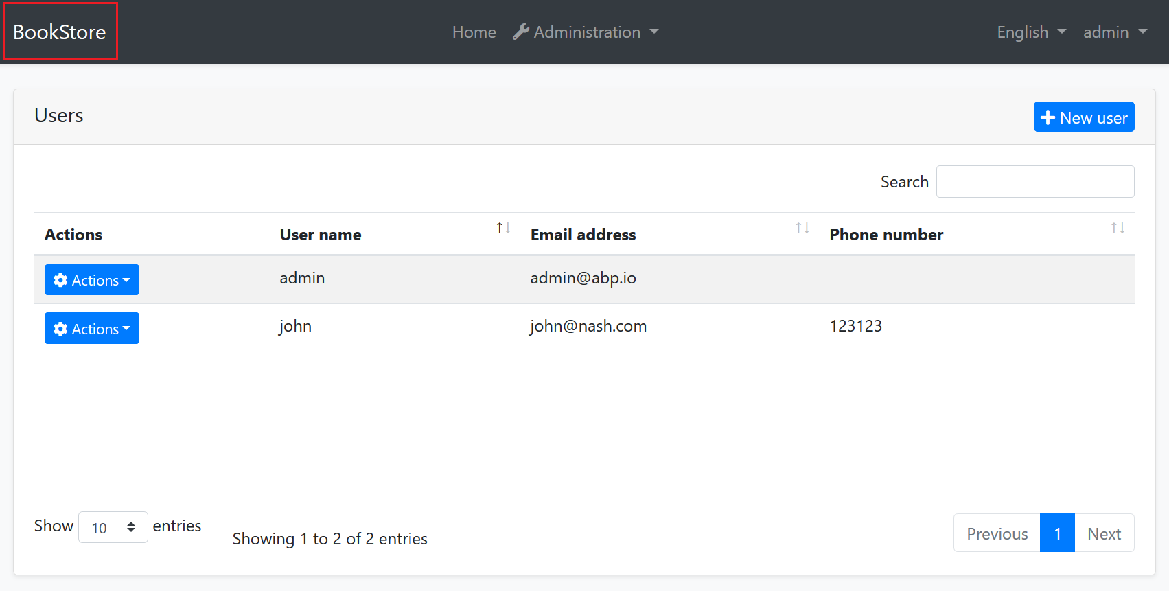
The Basic Theme defines some razor components for the layout. For example, the highlighted area with the red rectangle above is called Branding component. You probably want to customize this component by adding your own application logo. Let's see how to do it.
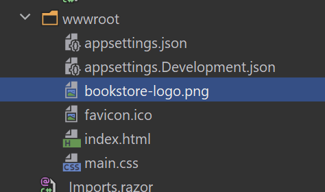
First, create your logo and place under a folder in your web application. We used wwwroot/bookstore-logo.png path:
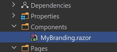
The next step is to create a razor component, like MyBranding.razor, in your application:
The content of the MyBranding.razor is shown below:
@using Volo.Abp.DependencyInjection


@using Volo.Abp.AspNetCore.Components.WebAssembly.BasicTheme.Themes.Basic


@inherits Branding
@attribute [ExposeServices(typeof(Branding))]
@attribute [Dependency(ReplaceServices = true)]
<a href="/">
    <img src="bookstore-logo.png" width="250" height="60"/>
</a>
Let's explain the code:
@inherits Brandingline inherits the Branding component defined by the Basic Theme (in theVolo.Abp.AspNetCore.Components.WebAssembly.BasicTheme.Themes.Basicnamespace).@attribute [ExposeServices(typeof(Branding))]registers this service (component) to dependency injection for theBrandingservice (component).@attribute [Dependency(ReplaceServices = true)]replaces theBrandingclass (component) with this newMyBrandingclass (component).- The rest of the code is related the content and styling of the component.
Now, you can run the application to see the result:
Since the component inherits from the component it is replacing, you can use all the non-private fields/properties/methods of the base component in the derived component.
Example: Replacing with the Code Behind File
If you prefer to use code-behind file for the C# code of your component, you can use the attributes in the C# side.
MyBlazor.razor
@using Volo.Abp.AspNetCore.Components.WebAssembly.BasicTheme.Themes.Basic

@inherits Branding
<a href="/">
    <img src="bookstore-logo.png" width="250" height="60"/>
</a>
MyBlazor.razor.cs
using Volo.Abp.AspNetCore.Components.WebAssembly.BasicTheme.Themes.Basic;


using Volo.Abp.DependencyInjection;

namespace MyProject.Blazor.Components
{
    [ExposeServices(typeof(Branding))]
    [Dependency(ReplaceServices = true)]
    public partial class MyBranding
    {

    }
}
Theming
The Theming system allows you to build your own theme. You can create your theme from scratch or get the Basic Theme and change however you like.
 08-09 May


