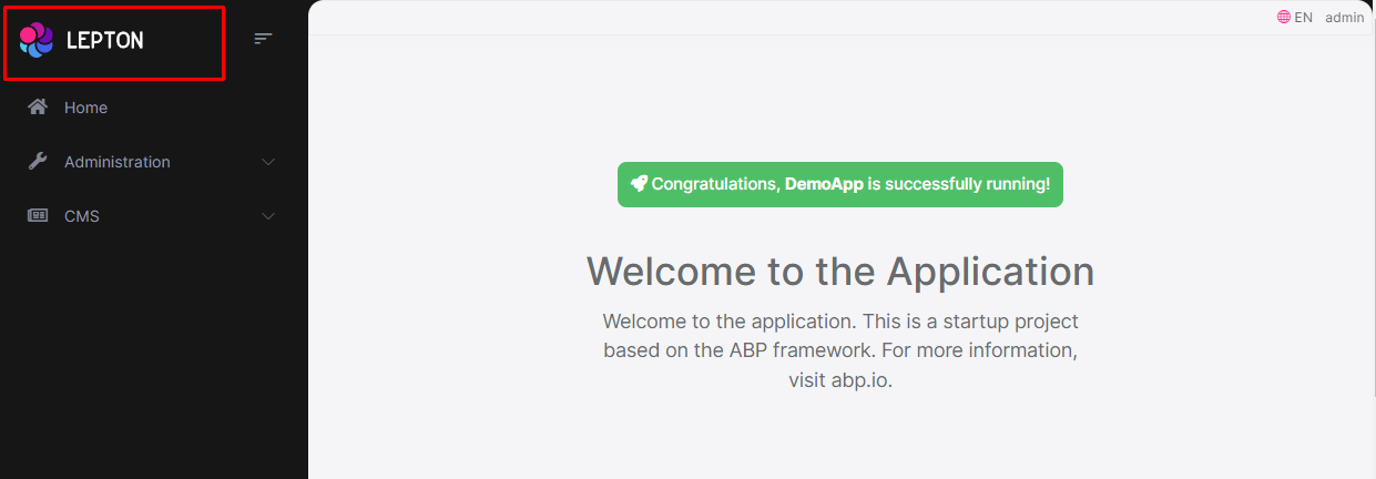
LeptonX Lite Angular UI
LeptonX Lite has implementation for the ABP Framework Angular Client. It's a simplified variation of the LeptonX Theme.
If you are looking for a professional, enterprise ready theme, you can check the LeptonX Theme, which is a part of ABP Commercial.
See the Theming document to learn about themes.
Installation
This theme is already installed when you create a new solution using the startup templates. If you are using any other template, you can install this theme by following the steps below:
To add LeptonX-lite into your project,
- Install
@abp/ng.theme.lepton-x
yarn add @abp/ng.theme.lepton-x
- Install
bootstrap-icons
yarn add bootstrap-icons
- Then, we need to edit the styles array in
angular.jsonto replace the existing style with the new one in the following link :
Note: You should remove the old theme styles from "angular.json" if you are switching from "ThemeBasic" or "Lepton." Look at the Theme Configurations list of styles. Depending on your theme, you can alter your styles in angular.json.
- Finally, remove
ThemeBasicModulefromapp.module.ts, and import the related modules inapp.module.ts
import { ThemeLeptonXModule } from "@abp/ng.theme.lepton-x";
import { SideMenuLayoutModule } from "@abp/ng.theme.lepton-x/layouts";

@NgModule({
  imports: [
    // ...

    // do not forget to remove ThemeBasicModule or other old theme module
    //  ThemeBasicModule.forRoot(),
    ThemeLeptonXModule.forRoot(),
    SideMenuLayoutModule.forRoot(),
  ],
  // ...
})
export class AppModule {}
Note: If you employ Resource Owner Password Flow for authorization, you should import the following module as well:
import { AccountLayoutModule } from "@abp/ng.theme.lepton-x/account";

@NgModule({
  // ...
  imports: [
    // ...
    AccountLayoutModule.forRoot(),
    // ...
  ],
  // ...
})
export class AppModule {}
To change the logos and brand color of LeptonX, simply add the following CSS to the styles.scss
:root {
  --lpx-logo: url("/assets/images/logo.png");
  --lpx-logo-icon: url("/assets/images/logo-icon.png");
  --lpx-brand: #edae53;
}
--lpx-logois used to place the logo in the menu.--lpx-logo-iconis a square icon used when the menu is collapsed.--lpx-brandis a color used throughout the application, especially on active elements.
Server Side
In order to migrate to LeptonX on your server side projects (Host and/or AuthServer projects), please follow the Server Side Migration document.
Customization
Layouts
The Angular version of LeptonX Lite provides layout components for your user interface on ABP Framework Theming. You can use the layouts to organize your user interface. You can replace the layout components and some parts of the layout components with the ABP replaceable component system.
The main responsibility of a theme is to provide the layouts. There are three pre-defined layouts that must be implemented by all the themes:
- ApplicationLayoutComponent: The default layout which is used by the main application pages.
- AccountLayoutComponent: Mostly used by the account module for login, register, forgot password... pages.
- EmptyLayoutComponent: The Minimal layout that has no layout components at all.
The Layout components and all the replacable components are predefined in eThemeLeptonXComponents as enum.
How to replace a component
import { ReplaceableComponentsService } from '@abp/ng.core'; // imported ReplaceableComponentsService
import { eIdentityComponents } from '@abp/ng.identity'; // imported eIdentityComponents enum
import { eThemeLeptonXComponents } from '@abp/ng.theme.lepton-x';   // imported eThemeLeptonXComponents enum

//...

@Component(/* component metadata */)
export class AppComponent {
  constructor(
    private replaceableComponents: ReplaceableComponentsService, // injected the service
  ) {
    this.replaceableComponents.add({
      component: YourNewApplicationLayoutComponent,
      key: eThemeLeptonXComponents.ApplicationLayout,
    });
  }
}
See the Component Replacement documentation for more information on how to replace components.
Brand Component
The brand component is a simple component that can be used to display your brand. It contains a logo and a company name. You can change the logo via css but if you want to change logo component, the key is eThemeLeptonXComponents.Logo
///...
this.replaceableComponents.add({
  component: YourNewLogoComponent,
  key: eThemeLeptonXComponents.Logo,
});
///...
Breadcrumb Component
On websites that have a lot of pages, breadcrumb navigation can greatly enhance the way users find their way around. In terms of usability, breadcrumbs reduce the number of actions a website visitor needs to take in order to get to a higher-level page, and they improve the findability of website sections and pages.
///...
this.replaceableComponents.add({
  component: YourNewSidebarComponent,
  key: eThemeLeptonXComponents.Breadcrumb,
});
///...
Navbar Component
Sidebar menus have been used as a directory for Related Pages to a Service offering, Navigation items to a specific service or topic and even just as Links the user may be interested in.
///...
this.replaceableComponents.add({
  component: YourNewSidebarComponent,
  key: eThemeLeptonXComponents.Navbar,
});
///...
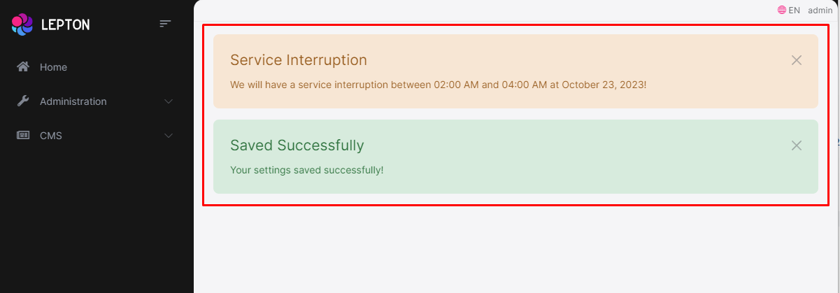
Page Alerts Component
Provides contextual feedback messages for typical user actions with a handful of available and flexible alert messages. Alerts are available for any length of text, as well as an optional dismiss button.
///...
this.replaceableComponents.add({
  component: YourNewPageAlertContainerComponent,
  key: eThemeLeptonXComponents.PageAlertContainer,
});
///...
Toolbar Component
Toolbar items are used to add extra functionality to the toolbar. The toolbar is a horizontal bar that contains a group of toolbar items.
///...
this.replaceableComponents.add({
  component: YourNewNavItemsComponent,
  key: eThemeLeptonXComponents.NavItems,
});
///...
Toolbar Items
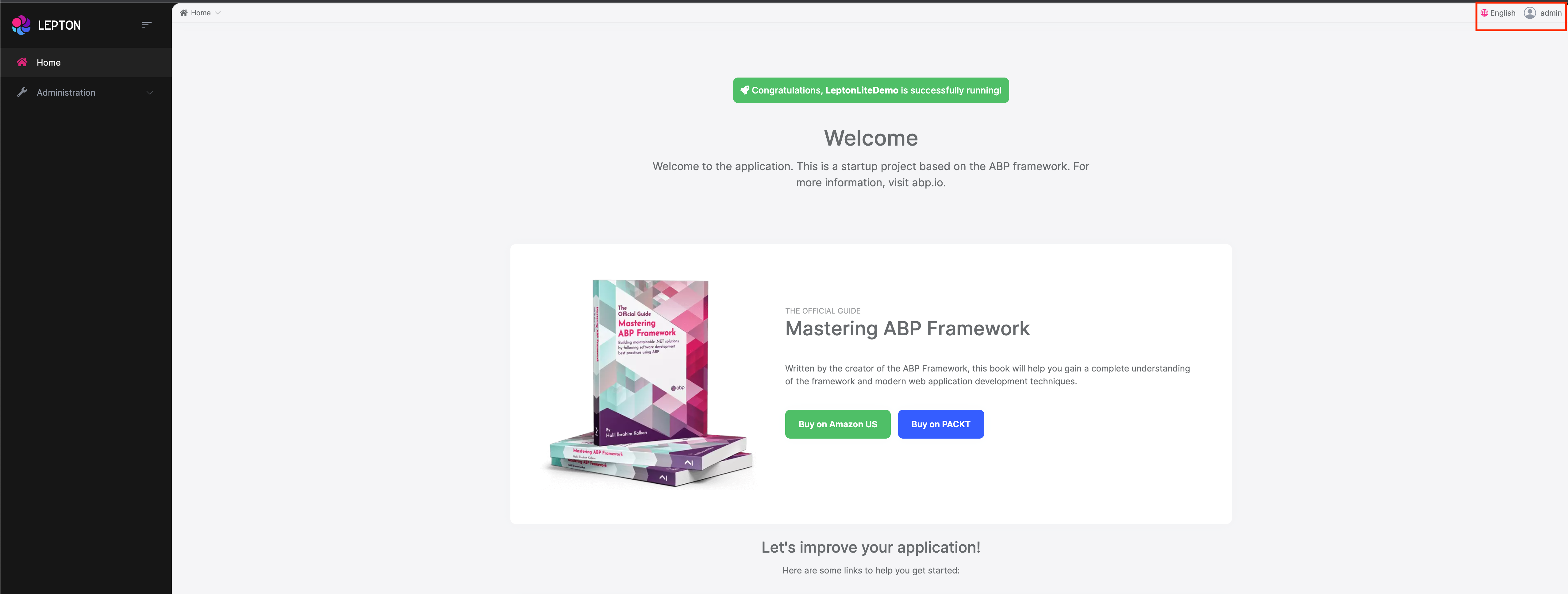
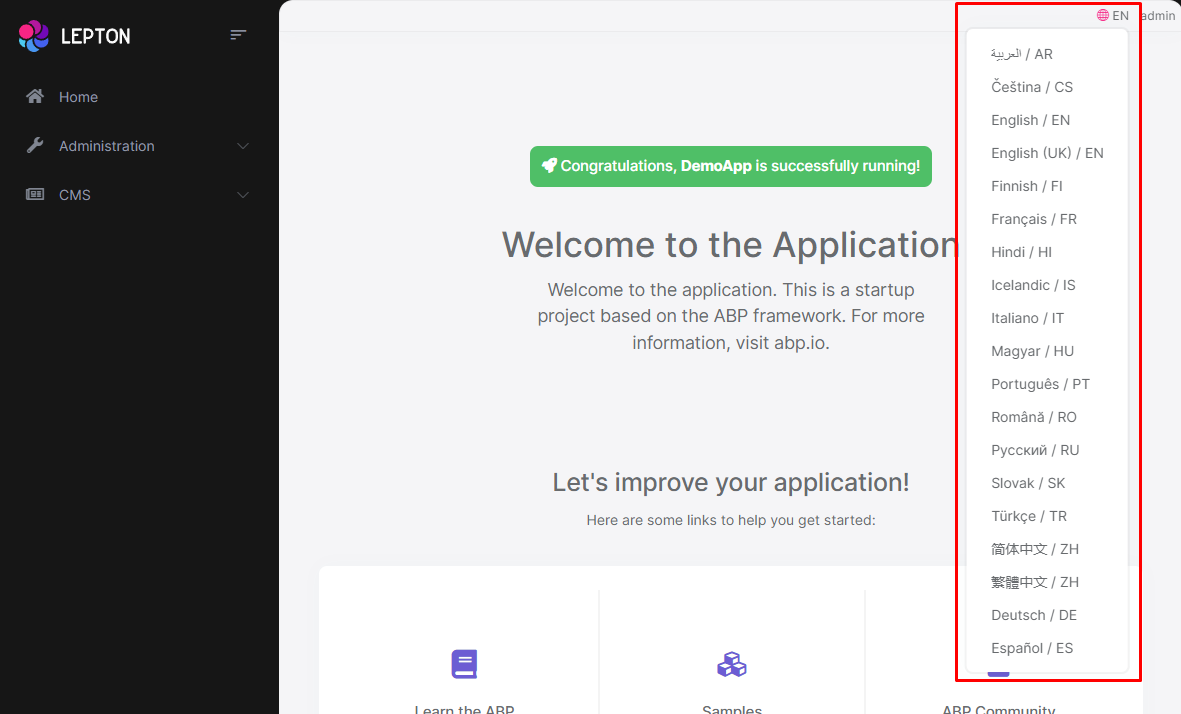
There are two parts to the toolbar. The first is Language-Switch. The second is the User-Profile element. You can swap out each of these parts individually.
Language Switch Component
Think about a multi-lingual website and the first thing that could hit your mind is the language switch component. A navigation bar is a great place to embed a language switch. By embedding the language switch in the navigation bar of your website, you would make it simpler for users to find it and easily switch the language without trying to locate it across the website.
///...
this.replaceableComponents.add({
  component: YourNewLanguagesComponent,
  key: eThemeLeptonXComponents.Languages,
});
///...
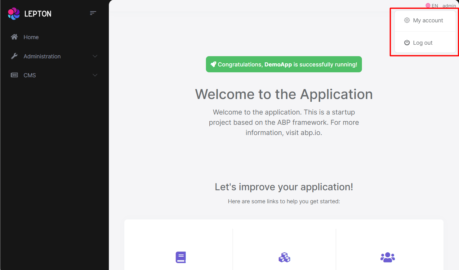
User Menu Component
The User Menu is the menu that drops down when you click your name or profile picture in the upper right corner of your page (in the toolbar). It drops down options such as Settings, Logout, etc.
///...
this.replaceableComponents.add({
  component: YourNewCurrentUserComponent,
  key: eThemeLeptonXComponents.CurrentUser,
});
///...
Note: The language selection component in the Volo app is not replaceable. It is part of the settings menu.
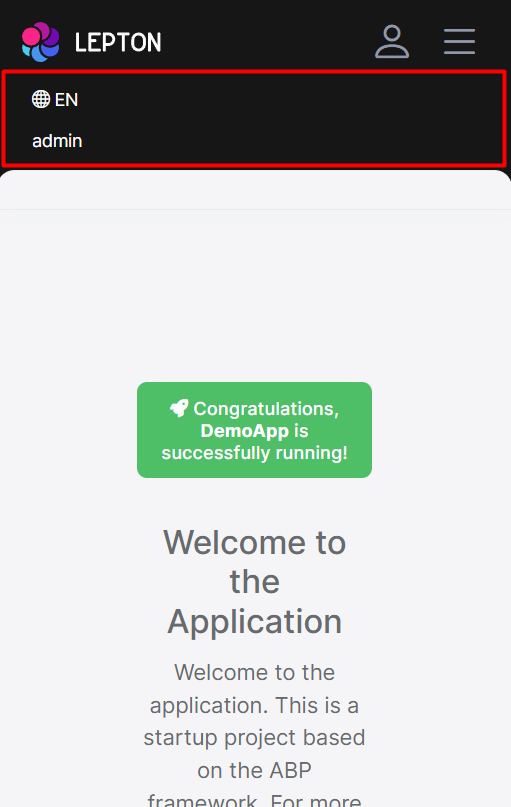
Mobile Navbar Component
The mobile navbar component is used to display the navbar menu on mobile devices. The mobile navbar component is a dropdown menu that contains language selection and user menu.
///...
this.replaceableComponents.add({
  component: YourNewMobileNavbarComponent,
  key: eThemeLeptonXComponents.MobileNavbar,
});
///...
Mobile Navbar Items.
There are two parts of the mobile navbar. The mobile navbar has Language-Switch and User-Profile. You can swap out each of these parts individually.
The Mobile language-Selection component key is eThemeLeptonXComponents.MobileLanguageSelection.
The Mobile User-Profile component key is eThemeLeptonXComponents.MobileUserProfile.
Footer Component
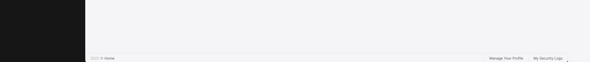
The Footer is the section of content at the very bottom of the site. This section of the content can be modified. Inject FooterLinksService and use the setFooterInfo method of FooterLinksService to assign path or link and description. descUrl and footerLinks are nullable. Constant footerLinks are on the right side of footer.
///...

const footerLinks = [
  {
    link: "/components/bootstrap/badge",
    text: "Manage Your Profile",
  },
  {
    link: "/components/bootstrap/border",
    text: "My Security Logs",
  },
];

const footerInfo: FooterNav = {
  desc: "Home",
  descUrl: "/components/home",
  footerLinks: footerLinks,
};

this.footerLinksService.setFooterInfo(footerInfo);

///...
If you want to change the footer component, the key is eThemeLeptonXComponents.Footer
///...
this.replaceableComponents.add({
  component: YourNewFooterComponent,
  key: eThemeLeptonXComponents.Footer,
});
///...
 08-09 May


