LeptonX Angular UI
To add LeptonX into your existing projects, follow the steps below.
- Firstly, install
@volosoft/abp.ng.theme.lepton-xusing the command below.
yarn add @volosoft/abp.ng.theme.lepton-x
- Then, edit
angular.jsonas follows:
Add theme-specific styles into the styles array of the file. Check the Theme Configurations documentation for more information.
Importing a CSS file as an ECMA module is not supported in Angular 14. Therefore, we need to add the styles in the angular.json file.
You can check the release notes of Angular 14 for more information.
- At last, remove
ThemeLeptonModulefromapp.module.tsandshared.module.ts, and import the following modules inapp.module.ts
import { HttpErrorComponent, ThemeLeptonXModule } from '@volosoft/abp.ng.theme.lepton-x';
import { SideMenuLayoutModule } from '@volosoft/abp.ng.theme.lepton-x/layouts';

@NgModule({
  // ...
  imports: [
    // ...
    // ThemeLeptonModule.forRoot(), -> remove this line.
    ThemeLeptonXModule.forRoot(),
    SideMenuLayoutModule.forRoot(), // depends on which layout you choose
    // ...
  ],
  // ...
})
export class AppModule {}
Note: If you are using Resource Owner Password Flow for authorization, you should import the following module as well to app.module.ts:
import { AccountLayoutModule } from '@volosoft/abp.ng.theme.lepton-x/account';

@NgModule({
  // ...
  imports: [
    // ...
    AccountLayoutModule.forRoot({
      layout: {
        authLayoutImg: '/assets/images/login-bg.jpg',
      },
    }),
    // ...
  ],
  // ...
})
export class AppModule {}
authLayoutImg: (Optional) If not given, a default image will be placed on the authentication pages.
- At this point,
LeptonXtheme should be up and running within your application. However, you may need to overwrite some css variables based your needs for every theme available as follows:
:root {
  .lpx-theme-dark {
    --lpx-logo: url('/assets/images/logo/logo-light.svg');
    --lpx-logo-icon: url('/assets/images/logo/logo-light-icon.svg');
    --lpx-brand: #edae53;
  }

  .lpx-theme-dim {
    --lpx-logo: url('/assets/images/logo/logo-light.svg');
    --lpx-logo-icon: url('/assets/images/logo/logo-light-icon.svg');
    --lpx-brand: #f15835;
  }

  .lpx-theme-light {
    --lpx-logo: url('/assets/images/logo/logo-dark.svg');
    --lpx-logo-icon: url('/assets/images/logo/logo-dark-icon.svg');
    --lpx-brand: #69aada;
  }
}
If everything is ok, you can remove the @volo/abp.ng.theme.lepton in package.json
Server Side
In order to migrate to LeptonX on your server side projects (Host and/or IdentityServer projects), please follow Server Side Migration document.
Customization
Layouts
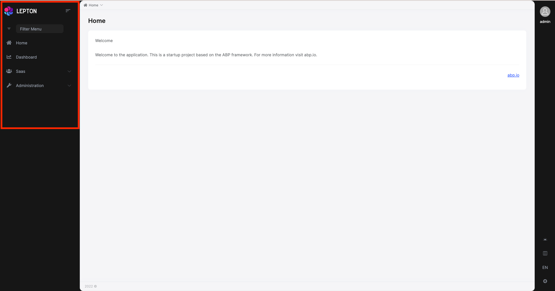
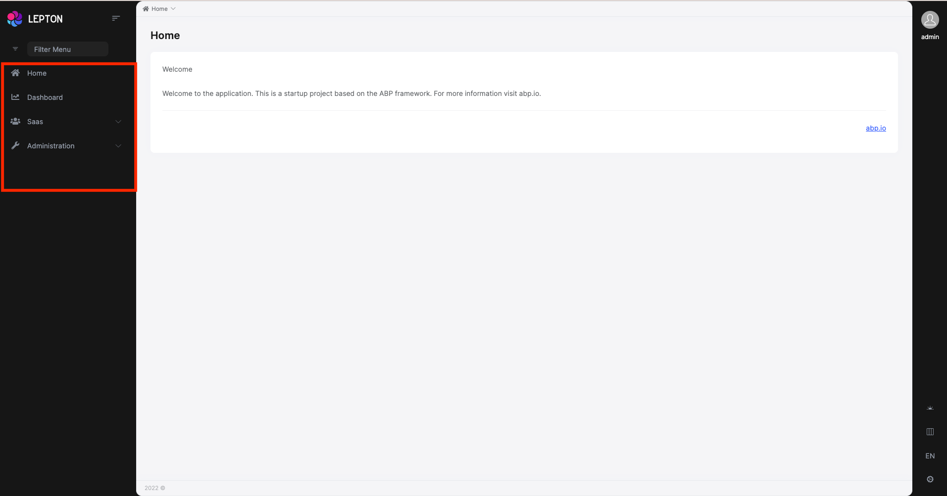
The Angular version of LeptonX provides layout components for your user interface on ABP Framework Theming. You can use layouts to organize your user interface. You can replace the layout components and some parts of the layout components with the ABP replaceable component system.
The main responsibility of a theme is to provide the layouts. There are three pre-defined layouts that must be implemented by all the themes:
ApplicationLayoutComponent: The default layout which is used by the main application pages.
AccountLayoutComponent: Mostly used by the account module for login, register, forgot password... pages.
EmptyLayoutComponent: The Minimal layout that has no layout components at all.
The Layout components and all the replacable components are predefined in eThemeLeptonXComponents as enum.
How to replace a component
import { ReplaceableComponentsService } from '@abp/ng.core'; // imported ReplaceableComponentsService
import {eThemeLeptonXComponents} from "@volosoft/abp.ng.theme.lepton-x"; // imported eThemeLeptonXComponents enum
//...
@Component(/* component metadata */)
export class AppComponent {
  constructor(
    private replaceableComponents: ReplaceableComponentsService, // injected the service
  ) {
    this.replaceableComponents.add({
      component: YourNewApplicationLayoutComponent,
      key: eThemeLeptonXComponents.ApplicationLayout,
    });
  }
}
See the Component Replacement documentation for more information on how to replace components.
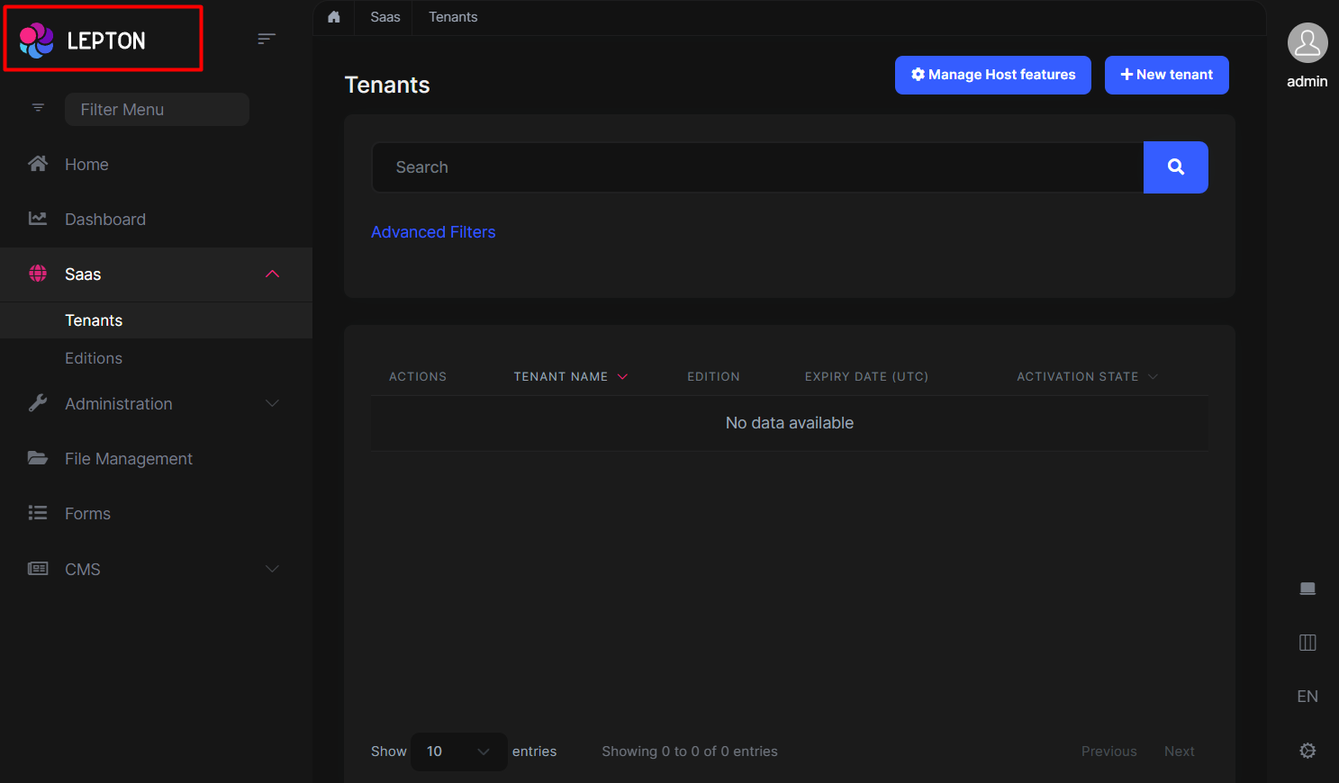
Brand Component
The brand component is a simple component that can be used to display your brand. It contains a logo and a company name.
You can change the logo with css but if you want to change logo component, the key is eThemeLeptonXComponents.Logo
///...
this.replaceableComponents.add({
  component: YourNewLogoComponent,
  key: eThemeLeptonXComponents.Logo,
});
///...
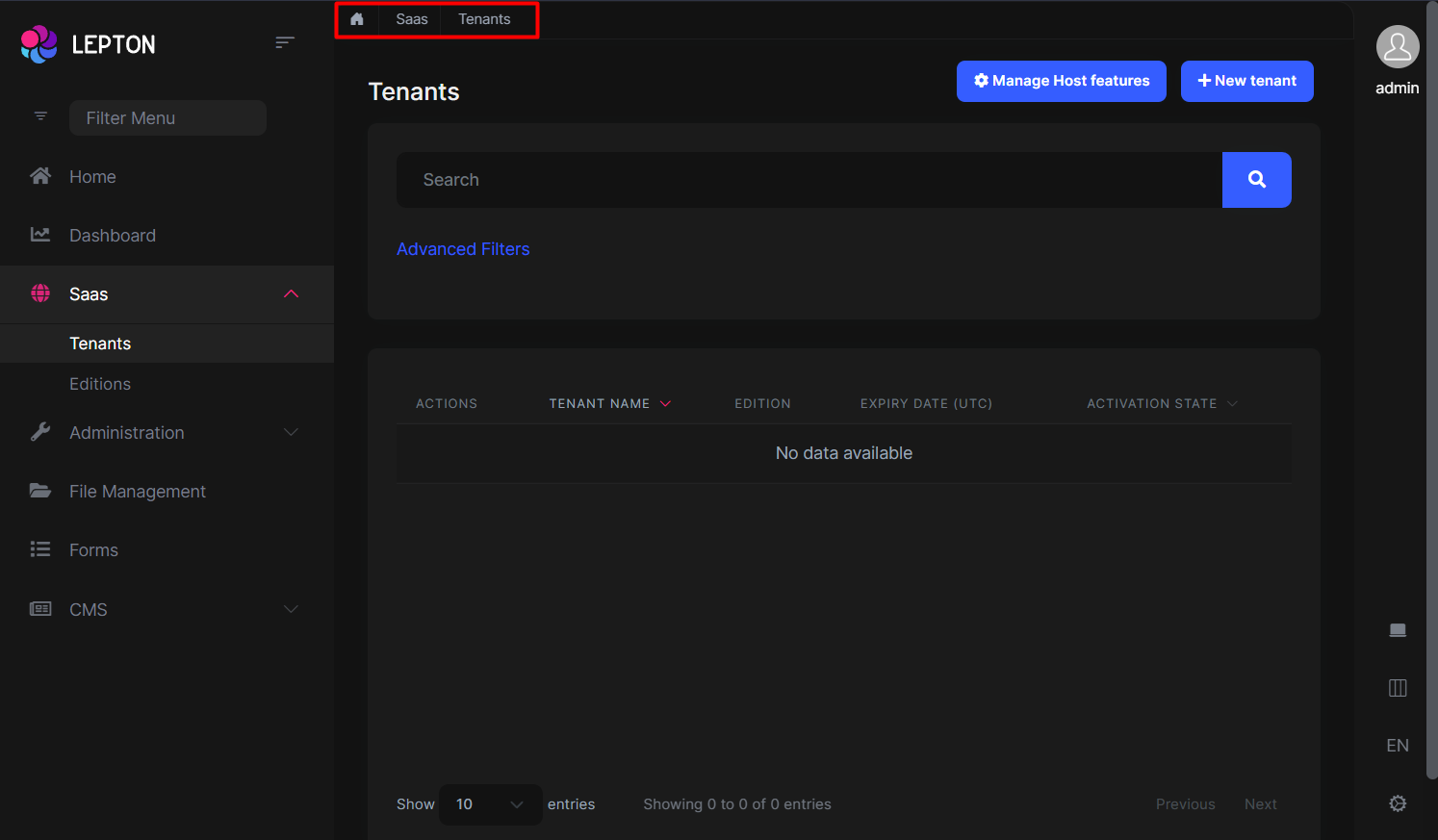
Breadcrumb Component
On websites that have a lot of pages, breadcrumb navigation can greatly enhance the way users find their way around. In terms of usability, breadcrumbs reduce the number of actions a website visitor needs to take in order to get to a higher-level page, and they improve the findability of website sections and pages.
///...
this.replaceableComponents.add({
  component: YourNewBreadCrumbComponent,
  key: eThemeLeptonXComponents.Breadcrumb,
});
///...
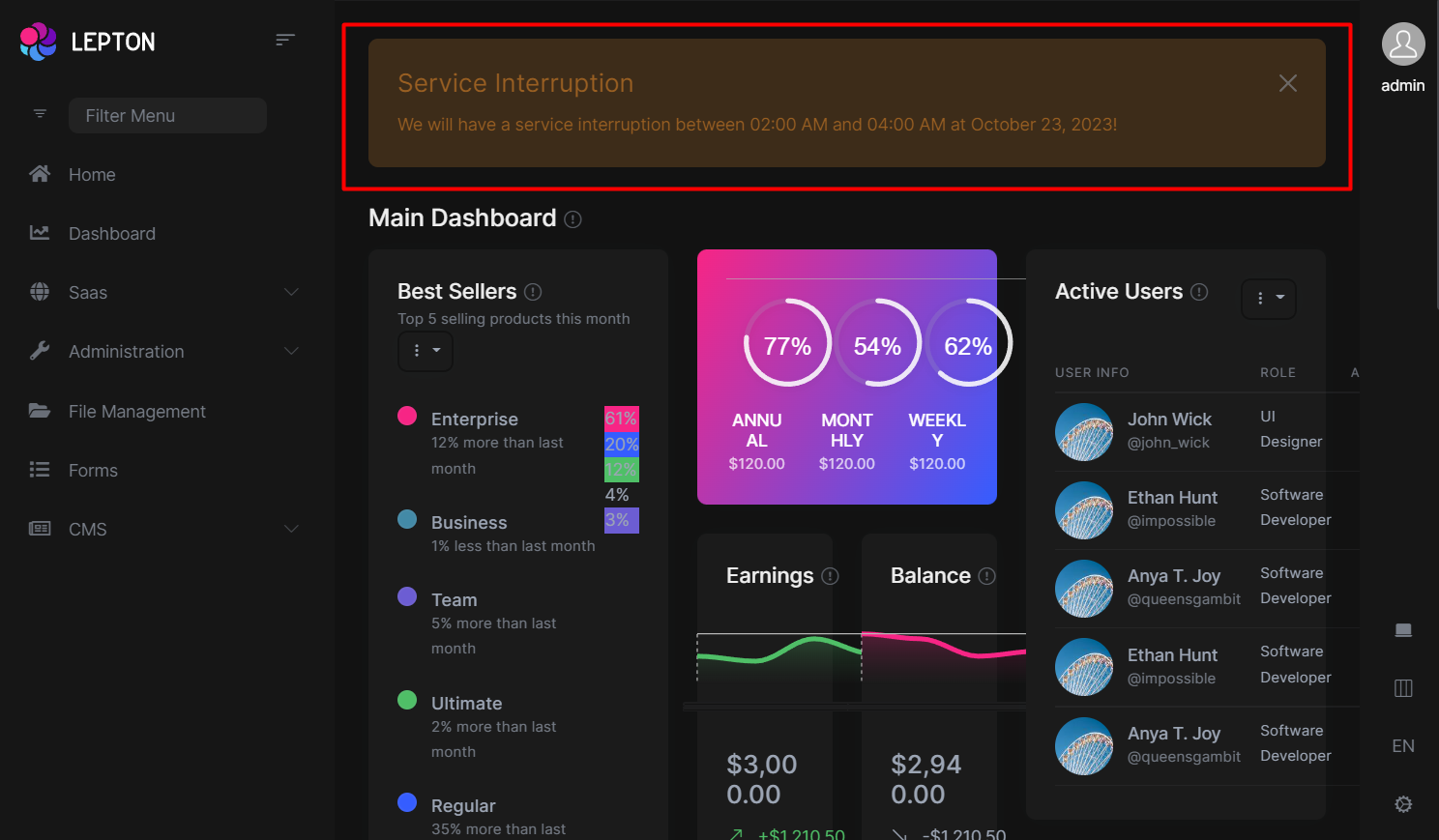
Page Alerts Component
Provides contextual feedback messages for typical user actions with a handful of available and flexible alert messages. Alerts are available for any length of text, as well as an optional dismiss button.
///...
this.replaceableComponents.add({
  component: YourNewPageAlertContainerComponent,
  key: eThemeLeptonXComponents.PageAlertContainerComponent,
});
///...
Toolbar Component
Toolbar items are used to add extra functionality to the toolbar. The toolbar is a horizontal bar that contains a group of toolbar items.
///...
this.replaceableComponents.add({
  component: YourNewToolbarComponent,
  key: eThemeLeptonXComponents.Toolbar,
});
///...
Navbar Component
Navbar items are used to add extra functionality to the Sidebar. The toolbar is a vertical bar that contains a group of Navbar routes.
///...
this.replaceableComponents.add({
  component: YourNewNavbarComponent,
  key: eThemeLeptonXComponents.Navbar,
});
///...
Routes Component
The routes component contains routes in the navbar.
///...
this.replaceableComponents.add({
  component: YourNewRoutesComponent,
  key: eThemeLeptonXComponents.Routes,
});
///...
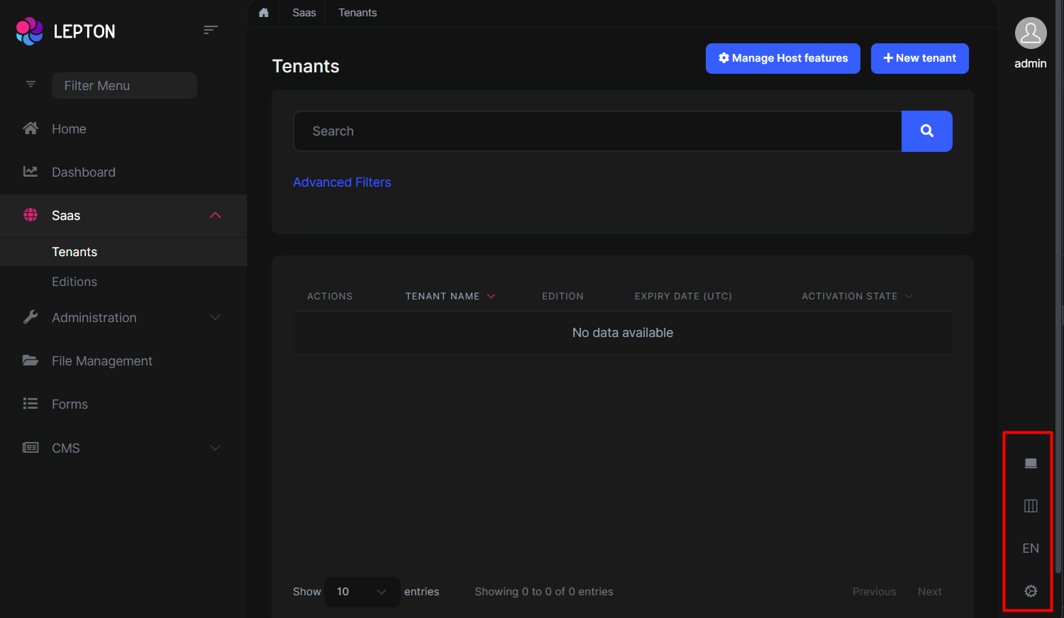
General Settings
- The general settings component is used to change your Appearance , Container width and Language. At the bottom right is the section that contains the settings.
///...
this.replaceableComponents.add({
  component: YourNewGeneralSettingsComponent,
  key: eThemeLeptonXComponents.Settings,
});
///...
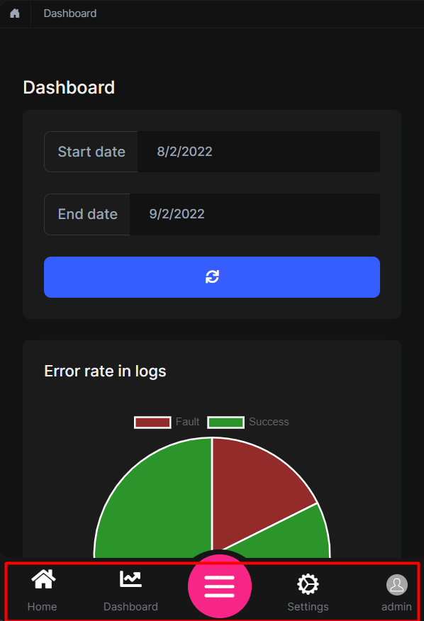
Mobile Navbar Component
The mobile navbar component is used to display the navbar menu on mobile devices. The mobile navbar component is a dropdown menu that contains language selection and user menu.
///...
this.replaceableComponents.add({
  component: YourNewMobileNavbarComponent,
  key: eThemeLeptonXComponents.NavbarMobile,
});
///...
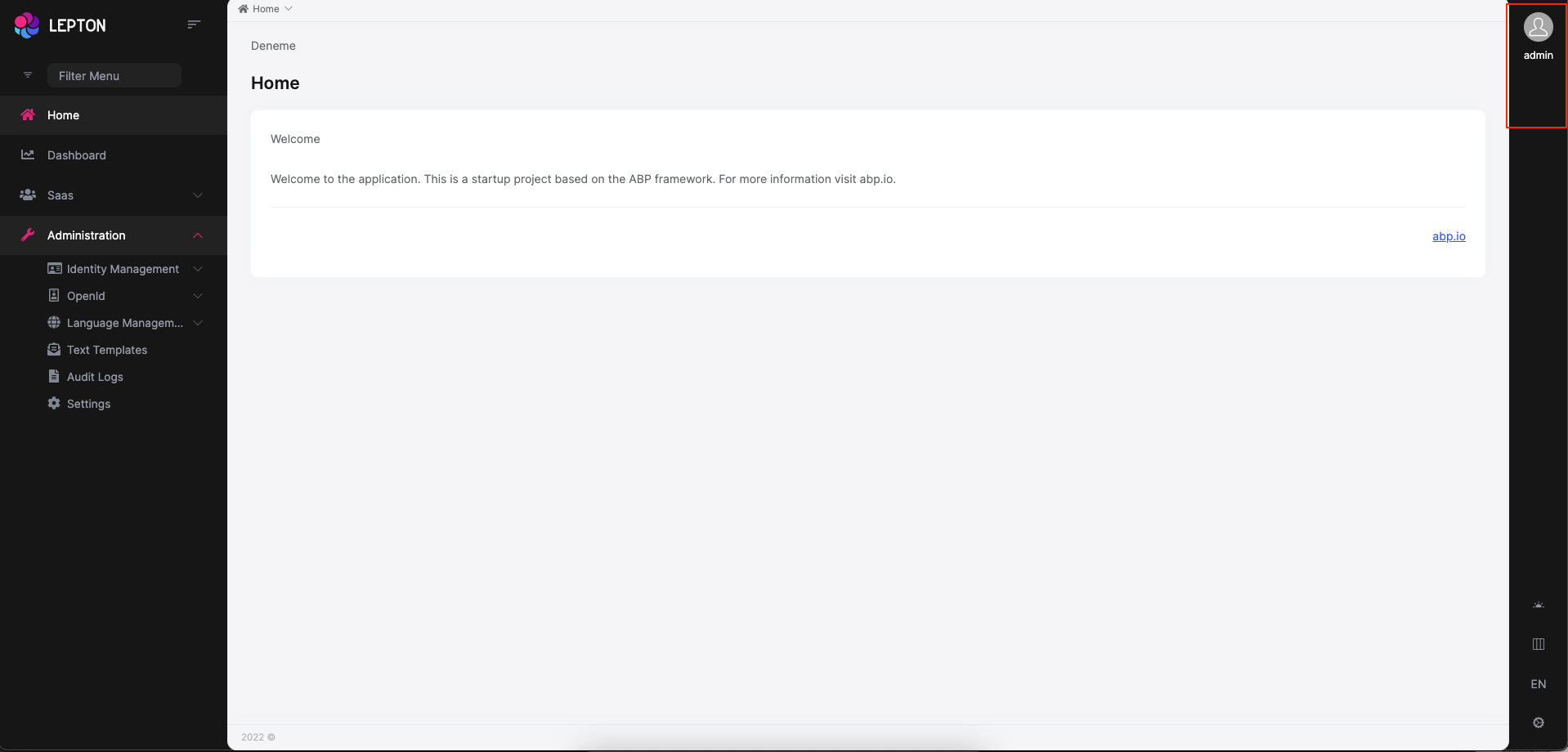
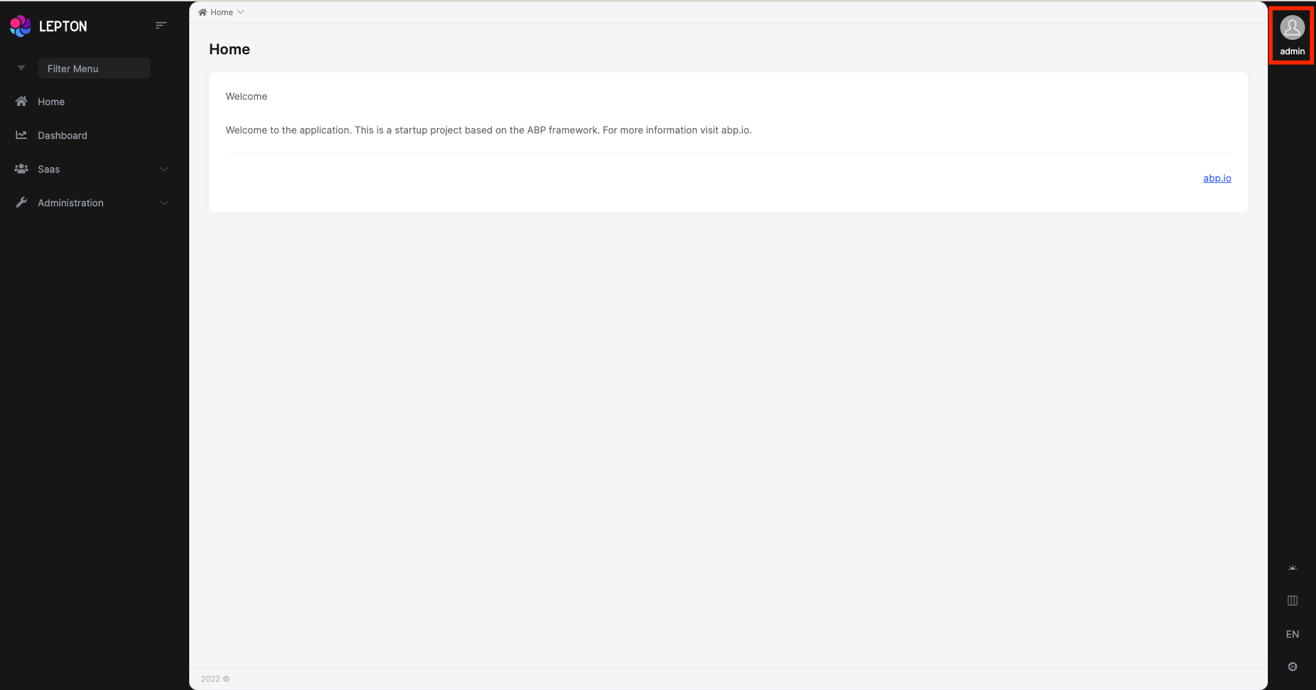
Avatar Component
The Avatar Component is your user image that displays on the Toolbar top right.
///...
this.replaceableComponents.add({
  component: YourNewAvatarComponent,
  key: eThemeLeptonXComponents.CurrentUserImage,
});
///...
Footer Component
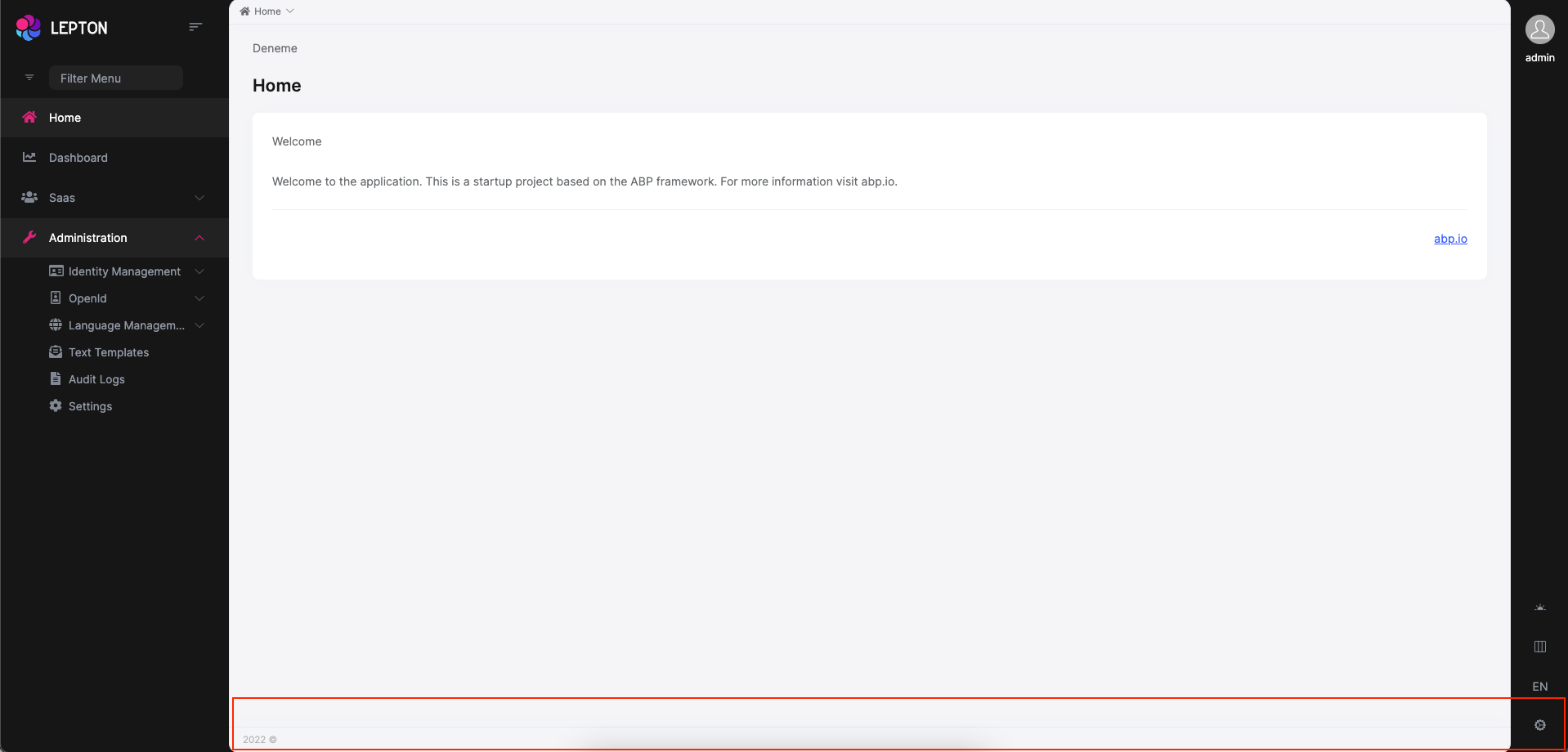
The Footer is the section of content at the very bottom of the site. This section of the content can be modified. Inject FooterLinksService and use the setFooterInfo method of FooterLinksService to assign path or link and description. descUrl and footerLinks are nullable. Constant footerLinks are on the right side of the footer.
///...
const footerLinks = [
  {
    link: "/account/manage",
    text: "Manage Your Profile",
  },
  {
    link: "/identity/security-logs",
    text: "My Security Logs",
  },
];
const footerInfo: FooterNav = {
  desc: "Home",
  descUrl: "/home",
  footerLinks: footerLinks,
};
this.footerLinksService.setFooterInfo(footerInfo);
///...
If you want to change the footer component, the key is eThemeLeptonXComponents.Footer
///...
this.replaceableComponents.add({
  component: YourNewFooterComponent,
  key: eThemeLeptonXComponents.Footer,
});
///...
Custom Layout
If you want to create your own layout, please refer to the Custom layout usage with Lepton X components documentation.
 08-09 May


