Entity Action Extensions for Angular UI
Introduction
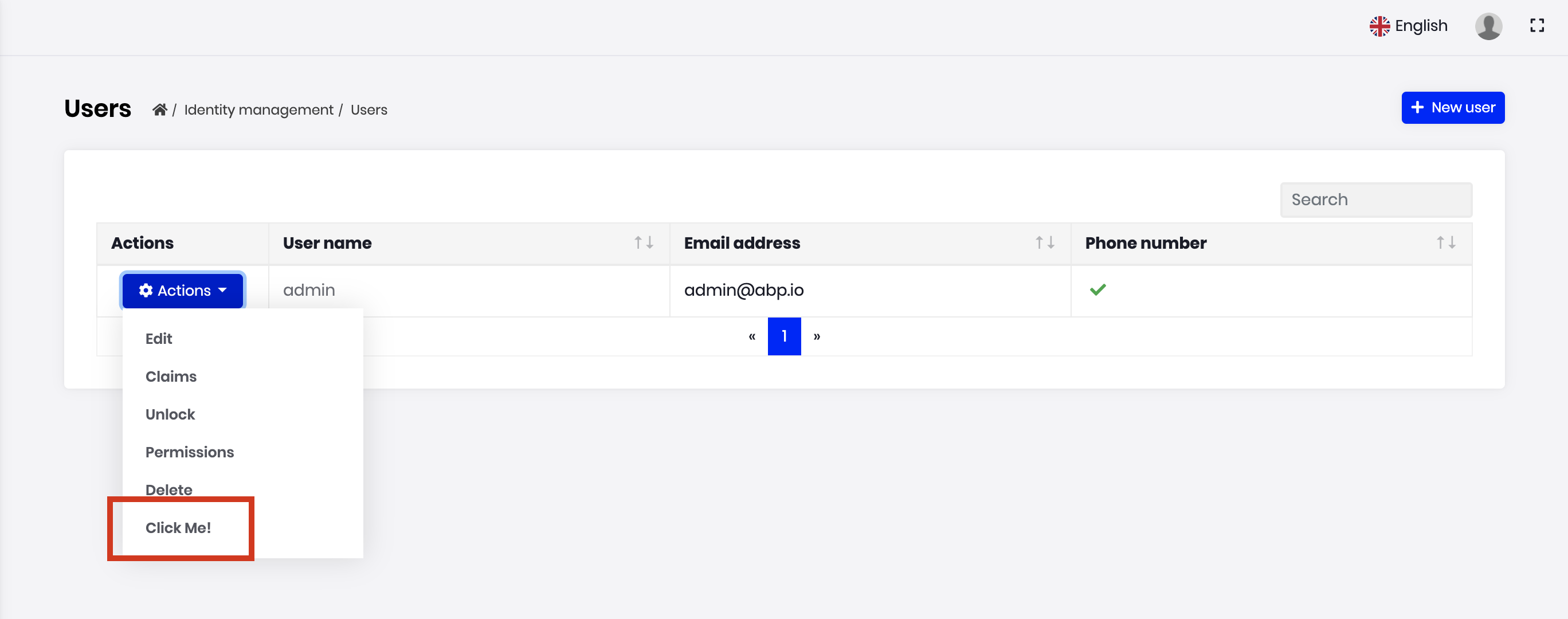
Entity action extension system allows you to add a new action to the action menu for an entity. A "Click Me" action was added to the user management page below:
You can take any action (open a modal, make an HTTP API call, redirect to another page... etc) by writing your custom code. You can access to the current entity in your code.
How to Set Up
In this example, we will add a "Click Me!" action and alert the current row's userName in the user management page of the Identity Module.
Step 1. Create Entity Action Contributors
The following code prepares a constant named identityEntityActionContributors, ready to be imported and used in your root module:
// entity-action-contributors.ts

import { EntityAction, EntityActionList } from '@abp/ng.theme.shared/extensions';
import { IdentityEntityActionContributors, IdentityUserDto } from '@volo/abp.ng.identity';

const alertUserName = new EntityAction<IdentityUserDto>({
  text: 'Click Me!',
  action: data => {
    // Replace alert with your custom code
    alert(data.record.userName);
  },
  // See EntityActionOptions in API section for all options
});

export function alertUserNameContributor(
  actionList: EntityActionList<IdentityUserDto>,
) {
  actionList.addTail(alertUserName);
}

export const identityEntityActionContributors: IdentityEntityActionContributors = {
  // enum indicates the page to add contributors to
  [eIdentityComponents.Users]: [
    alertUserNameContributor,
    // You can add more contributors here
  ],
};
The list of actions, conveniently named as actionList, is a doubly linked list. That is why we have used the addTail method, which adds the given value to the end of the list. You may find all available methods here.
Important Note 1: AoT compilation does not support function calls in decorator metadata. This is why we have defined
alertUserNameContributoras an exported function declaration here. Please do not forget exporting your contributor callbacks and forget about lambda functions (a.k.a. arrow functions). Please refer to AoT metadata errors for details.
Important Note 2: Please use one of the following if Ivy is not enabled in your project. Otherwise, you will get an "Expression form not supported." error.
export const identityEntityActionContributors: IdentityEntityActionContributors = {
  'Identity.UsersComponent': [ alertUserNameContributor ],
};

/* OR */

const identityContributors: IdentityEntityActionContributors = {};
identityContributors[eIdentityComponents.Users] = [ alertUserNameContributor ];
export const identityEntityActionContributors = identityContributors;
Step 2. Import and Use Entity Action Contributors
Import identityEntityActionContributors in your routing module and pass it to the static forLazy method of IdentityModule as seen below:
import { identityEntityActionContributors } from './entity-action-contributors';

const routes: Routes = [
  {
    path: '',
    component: DynamicLayoutComponent,
    children: [
      {
        path: 'identity',
        loadChildren: () =>
          import('@volo/abp.ng.identity').then(m =>
            m.IdentityModule.forLazy({
              entityActionContributors: identityEntityActionContributors,
            }),
          ),
      },
      // other child routes
    ],
    // other routes
  }
];
That is it, alertUserName entity action will be added as the last action on the grid dropdown in the users page (UsersComponent) of the IdentityModule.
How to Place a Custom Modal and Trigger It by Entity Actions
Incase you need to place a custom modal that will be triggered by an entity action, there are two ways to do it: A quick one and an elaborate one.
The Quick Solution
- Place your custom modal inside
AppComponenttemplate.
<abp-modal [(visible)]="isModalOpen">
  <ng-template #abpHeader>
    <h3><!-- YOUR TITLE HERE --></h3>
  </ng-template>

  <ng-template #abpBody>
    <!-- YOUR CONTENT HERE -->
  </ng-template>

  <ng-template #abpFooter>
    <button type="button" class="btn btn-secondary" #abpClose>
      {{ 'AbpIdentity::Cancel' | abpLocalization }}
    </button>

    <!-- YOUR CONFIRMATION BUTTON HERE -->
  </ng-template>
</abp-modal>
- Add the following inside your
AppComponentclass:
isModalOpen: boolean;

openModal(/* may take parameters */) {
  /* and set things before showing the modal */
  this.isModalOpen = true;
}
- Add an entity action similar to this:
const customModalAction = new EntityAction<IdentityUserDto>({
  text: 'Custom Modal Action',
  action: data => {
    const component = data.getInjected(AppComponent);
    component.openModal(/* you may pass parameters */);
  },
});
That should work. However, there is a longer but lazy-loading solution, and we are going to use NGXS for it.
The Elaborate Solution
Consider the modal will be displayed in the Identity module. How can we lazy-load it too?
- Create a folder called
identity-extendedinside your app folder. - Create a file called
identity-popups.store.tsin it. - Insert the following code in the new file:
import { Action, Selector, State, StateContext } from '@ngxs/store';

export class ToggleIdentityPopup {
  static readonly type = '[IdentityPopups] Toggle';
  constructor(public readonly payload: boolean) {}
}

@State<IdentityPopupsStateModel>({
  name: 'IdentityPopups',
  defaults: {
    isVisible: false,
  },
})
export class IdentityPopupsState {
  @Selector()
  static isVisible(state: IdentityPopupsStateModel) {
    return state.isVisible;
  }

  @Action(ToggleIdentityPopup)
  toggleModal(
    context: StateContext<IdentityPopupsStateModel>,
    { payload }: ToggleIdentityPopup,
  ) {
    context.patchState({ isVisible: payload });
  }
}

interface IdentityPopupsStateModel {
  isVisible: boolean;
}
- Create a file called
identity-extended.module.tsin the same folder. - Insert the following code in the new file:
import { CoreModule } from '@abp/ng.core';
import { ThemeSharedModule } from '@abp/ng.theme.shared';
import { Component, NgModule } from '@angular/core';
import { RouterModule } from '@angular/router';
import { NgxsModule, Select, Store } from '@ngxs/store';
import { Observable } from 'rxjs';
import { IdentityPopupsState, ToggleIdentityPopup } from './identity-popups.store';

@Component({
  template: `
    <router-outlet></router-outlet>
    <router-outlet name="popup"></router-outlet>
  `,
})
export class IdentityOutletComponent {}

@Component({
  template: `
    <abp-modal [visible]="isVisible$ | async" (disappear)="onDisappear()">
      <ng-template #abpHeader>
        <h3><!-- YOUR TITLE HERE --></h3>
      </ng-template>

      <ng-template #abpBody>
        <!-- YOUR CONTENT HERE -->
      </ng-template>

      <ng-template #abpFooter>
        <button type="button" class="btn btn-secondary" #abpClose>
          {{ 'AbpIdentity::Cancel' | abpLocalization }}
        </button>

        <!-- YOUR CONFIRMATION BUTTON HERE -->
      </ng-template>
    </abp-modal>
  `,
})
export class IdentityPopupsComponent {
  @Select(IdentityPopupsState.isVisible)
  isVisible$: Observable<boolean>;

  constructor(private store: Store) {}

  onDisappear() {
    this.store.dispatch(new ToggleIdentityPopup(false));
  }
}

@NgModule({
  declarations: [IdentityPopupsComponent, IdentityOutletComponent],
  imports: [
    CoreModule,
    ThemeSharedModule,
    NgxsModule.forFeature([IdentityPopupsState]),
    RouterModule.forChild([
      {
        path: '',
        component: IdentityOutletComponent,
        children: [
          {
            path: '',
            outlet: 'popup',
            component: IdentityPopupsComponent,
          },
          {
            path: '',
            loadChildren: () => import('@volo/abp.ng.identity').then(m => m.IdentityModule),
          },
        ],
      },
    ]),
  ],
})
export class IdentityExtendedModule {}
- Change the
identitypath in yourAppRoutingModuleto this:
{
  path: 'identity',
  loadChildren: () =>
    import('./identity-extended/identity-extended.module').then(m => m.IdentityExtendedModule),
},
- Add an entity action similar to this:
const customModalAction = new EntityAction<IdentityUserDto>({
  text: 'Custom Modal Action',
  action: data => {
    const store = data.getInjected(Store);
    store.dispatch(new ToggleIdentityPopup(true));
  },
});
It should now be working well with lazy-loading. The files are compact in the description to make it quicker to explain. You may split the files as you wish.
API
ActionData<R = any>
ActionData is the shape of the parameter passed to all callbacks or predicates in an EntityAction.
It has the following properties:
record is the row data, i.e. current value rendered in the table.
{
  text: 'Click Me!',
  action: data => {
    alert(data.record.userName);
  },
}
index is the table index where the record is at.
getInjected is the equivalent of Injector.get. You can use it to reach injected dependencies of
GridActionsComponent, including, but not limited to, its parent component.{ text: 'Click Me!', action: data => { const restService = data.getInjected(RestService); // Use restService public props and methods here }, visible: data => { const usersComponent = data.getInjected(UsersComponent); // Use usersComponent public props and methods here }, }
ActionCallback<T, R = any>
ActionCallback is the type of the callback function that can be passed to an EntityAction as action parameter. An action callback gets a single parameter, the ActionData. The return type may be anything, including void. Here is a simplified representation:
type ActionCallback<T, R = any> = (data?: ActionData<T>) => R;
ActionPredicate<T>
ActionPredicate is the type of the predicate function that can be passed to an EntityAction as visible parameter. An action predicate gets a single parameter, the ActionData. The return type must be boolean. Here is a simplified representation:
type ActionPredicate<T> = (data?: ActionData<T>) => boolean;
EntityActionOptions<R = any>
EntityActionOptions is the type that defines required and optional properties you have to pass in order to create an entity action.
Its type definition is as follows:
type EntityActionOptions<R = any> = {
  action: ActionCallback<R>,
  text: string,
  icon?: string,
  permission?: string,
  visible?: ActionPredicate<R>,
};
As you see, passing action and text is enough to create an entity action. Here is what each property is good for:
- action is a callback that is called when the grid action is clicked. (required)
- text is the button text which will be localized. (required)
- icon is the classes that define an icon to be placed before the text. (default:
'') - permission is the permission context which will be used to decide if this type of grid action should be displayed to the user or not. (default:
undefined) - visible is a predicate that will be used to decide if the current record should have this grid action or not. (default:
() => true)
You may find a full example below.
EntityAction<R = any>
EntityAction is the class that defines your entity actions. It takes an EntityActionOptions and sets the default values to the properties, creating an entity action that can be passed to an entity contributor.
const options: EntityActionOptions<IdentityUserDto> = {
  action: data => {
    const component = data.getInjected(UsersComponent);
    component.unlock(data.record.id);
  },
  text: 'AbpIdentity::Unlock',
  icon: 'fa fa-unlock',
  permission: 'AbpIdentity.Users.Update',
  visible: data => data.record.isLockedOut,
};

const action = new EntityAction(options);
It also has two static methods to create its instances:
- EntityAction.create<R = any>(options: EntityActionOptions<R>) is used to create an instance of
EntityAction.const action = EntityAction.create(options); - EntityAction.createMany<R = any>(options: EntityActionOptions<R>[]) is used to create multiple instances of
EntityActionwith given array ofEntityActionOptions.const actions = EntityAction.createMany(optionsArray);
EntityActionList<R = any>
EntityActionList is the list of actions passed to every action contributor callback as the first parameter named actionList. It is a doubly linked list. You may find all available methods here.
The items in the list will be displayed according to the linked list order, i.e. from head to tail. If you want to re-order them, all you have to do is something like this:
export function reorderUserContributors(
  actionList: EntityActionList<IdentityUserDto>,
) {
  // drop "Unlock" button
  const unlockActionNode = actionList.dropByValue(
    'AbpIdentity::Unlock',
    (action, text) => action.text === text,
  );

  // add it back to the head of the list
  actionList.addHead(unlockActionNode.value);
}
EntityActionContributorCallback<R = any>
EntityActionContributorCallback is the type that you can pass as entity action contributor callbacks to static forLazy methods of the modules.
// lockUserContributor should have EntityActionContributorCallback<IdentityUserDto> type

export function lockUserContributor(
  actionList: EntityActionList<IdentityUserDto>,
) {
  // add lockUser as 3rd action
  actionList.add(lockUser).byIndex(2);
}

export const identityEntityActionContributors = {
  [eIdentityComponents.Users]: [lockUserContributor],
};
 08-09 May


