Card Component
The ABP Card Component is a wrapper component for the Bootstrap card class. It supports all the features that Bootstrap card component provides.
ABP Card Component has three main components, CardHeader, CardBody and CardFooter. These components have their own class and style inputs
| Component | Selector | Input Properties |
|---|---|---|
| CardHeader | abp-card-header |
cardHeaderClass,cardHeaderStyle |
| CardBody | abp-card-body |
cardBodyClass,cardBodyStyle |
| CardFooter | abp-card-footer |
cardFooterClass,cardFooterStyle |
In addition to these components, the Card component provides directives like CardHeader,CardTitle,CardSubtitle,CardImgTop.
| Directive | Selector |
|---|---|
| CardHeader | abp-card-header,[abp-card-header],[abpCardHeader] |
| CardTitle | abp-card-title,[abp-card-title],[abpCardTitle] |
| CardSubtitle | abp-card-subtitle,[abp-card-subtitle],[abpCardSubtitle] |
| CardImgTop | abp-card-img-top,[abp-card-img-top],[abpCardImgTop] |
Usage
ABP Card Component is a part of the ThemeSharedModule module. If you've imported that module into your module, you don't need to import it again. If not, first import it as shown below:
// my-feature.module.ts

import { ThemeSharedModule } from '@abp/ng.theme.shared';
import { CardDemoComponent } from './card-demo.component';

@NgModule({
  imports: [
    ThemeSharedModule ,
    // ...
  ],
  declarations: [CardDemoComponent],
  // ...
})
export class MyFeatureModule {}
Then, the abp-card component can be used. See the examples below:
CardBody
// card-demo.component.ts

import { Component } from '@angular/core';

@Component({
  selector: 'app-card-demo',
  template: `
    <abp-card [cardStyle]="{width: '18rem'}">
      <abp-card-body>This is some text within a card body</abp-card-body>
    </abp-card>
  `,
})
export class CardDemoComponent { }
See the card body result below:

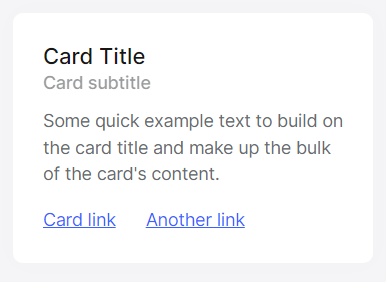
Titles, Text and Links
//card-demo.component.ts
import { Component } from '@angular/core';

@Component({
  selector: 'app-card-demo',
  template: `
    <abp-card [cardStyle]="{width: '18rem'}">
      <abp-card-body>
        <h5 abpCardTitle>Card Title</h5>
        <h6 abpCardSubtitle class="mb-2 text-muted">Card subtitle</h6>
        <p class="card-text">Some quick example text to build on the card title and make up the bulk of the card's content.</p>
        [Card link](/en/abp/latest/UI/Angular/#)
        [Another link](/en/abp/latest/UI/Angular/#)
      </abp-card-body>
    </abp-card>
  `,
})
export class CardDemoComponent { }
See the card title, text and link result below:
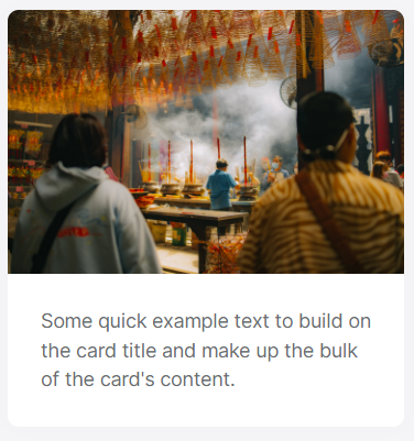
Images
//card-demo.component.ts
import { Component } from '@angular/core';

@Component({
  selector: 'app-card-demo',
  template: `
    <abp-card [cardStyle]="{width:'18rem'}">
      <img abpCardImgTop src="..." alt="...">
      <abp-card-body>
        <p class="card-text" >Some quick example text to build on the card title and make up the bulk of the card's content.</p>
      </abp-card-body>
    </abp-card>
  `,
})
export class CardDemoComponent { }
See the card image result below:
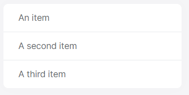
List Groups
//card-demo.component.ts
import { Component } from '@angular/core';

@Component({
  selector: 'app-card-demo',
  template: `
    <abp-card [cardStyle]="{width:'18rem'}">
      <ul class="list-group list-group-flush">
        <li class="list-group-item">An item</li>
        <li class="list-group-item">A second item</li>
        <li class="list-group-item">A third item</li>
      </ul>
    </abp-card>
  `,
})
export class CardDemoComponent { }
See the group list result below:
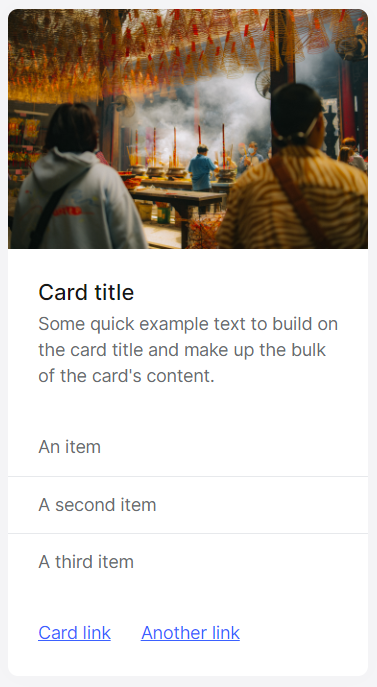
Kitchen Sink
//card-demo.component.ts
import { Component } from '@angular/core';

@Component({
  selector: 'app-card-demo',
  template: `
    <abp-card [cardStyle]="{width:'18rem'}">
      <img abpCardImgTop src="../../assets/thinh-nguyen-aRrS37GKlVA-unsplash.jpg" alt="...">
      <abp-card-body>
        <h5 abpCardTitle>Card title</h5>
        <p class="card-text">Some quick example text to build on the card title and make up the bulk of the card's content.</p>
      </abp-card-body>
      <ul class="list-group list-group-flush">
        <li class="list-group-item">An item</li>
        <li class="list-group-item">A second item</li>
        <li class="list-group-item">A third item</li>
      </ul>
      <abp-card-body>
        [Card link](/en/abp/latest/UI/Angular/#)
        [Another link](/en/abp/latest/UI/Angular/#)
      </abp-card-body>
    </abp-card>
  `,
})
export class CardDemoComponent { }
See kitchen sink result below:
Header and Footer
//card-demo.component.ts
import { Component } from '@angular/core';

@Component({
  selector: 'app-card-demo',
  template: `
    <abp-card class="text-center">
      <abp-card-header>Featured</abp-card-header>
      <abp-card-body>
        <h5 abpCardTitle>Special title treatment</h5>
        <p class="card-text">With supporting text below as a natural lead-in to additional content.</p>
        [Go somewhere](/en/abp/latest/UI/Angular/#)
      </abp-card-body>
      <abp-card-footer class="text-muted">
        2 days ago
      </abp-card-footer>
    </abp-card>
  `,
})
export class CardDemoComponent { }
See the header and footer result below:

 08-09 May


